“The Story of the Stuff” is an interactive, multimedia project that provides insight to the relief efforts that the people of Newtown, CT suffered on the day of the Sandy Hook Elementary School shooting. This project focuses on the items donated to Newtown and the overwhelming support that came with those items in a time of tragedy. This project greatly benefits from becoming digitalized because it shows, through the use of pictures, videos, interview recordings, and a timeline of other related events, that the information is readily available in the most easily accessible way.
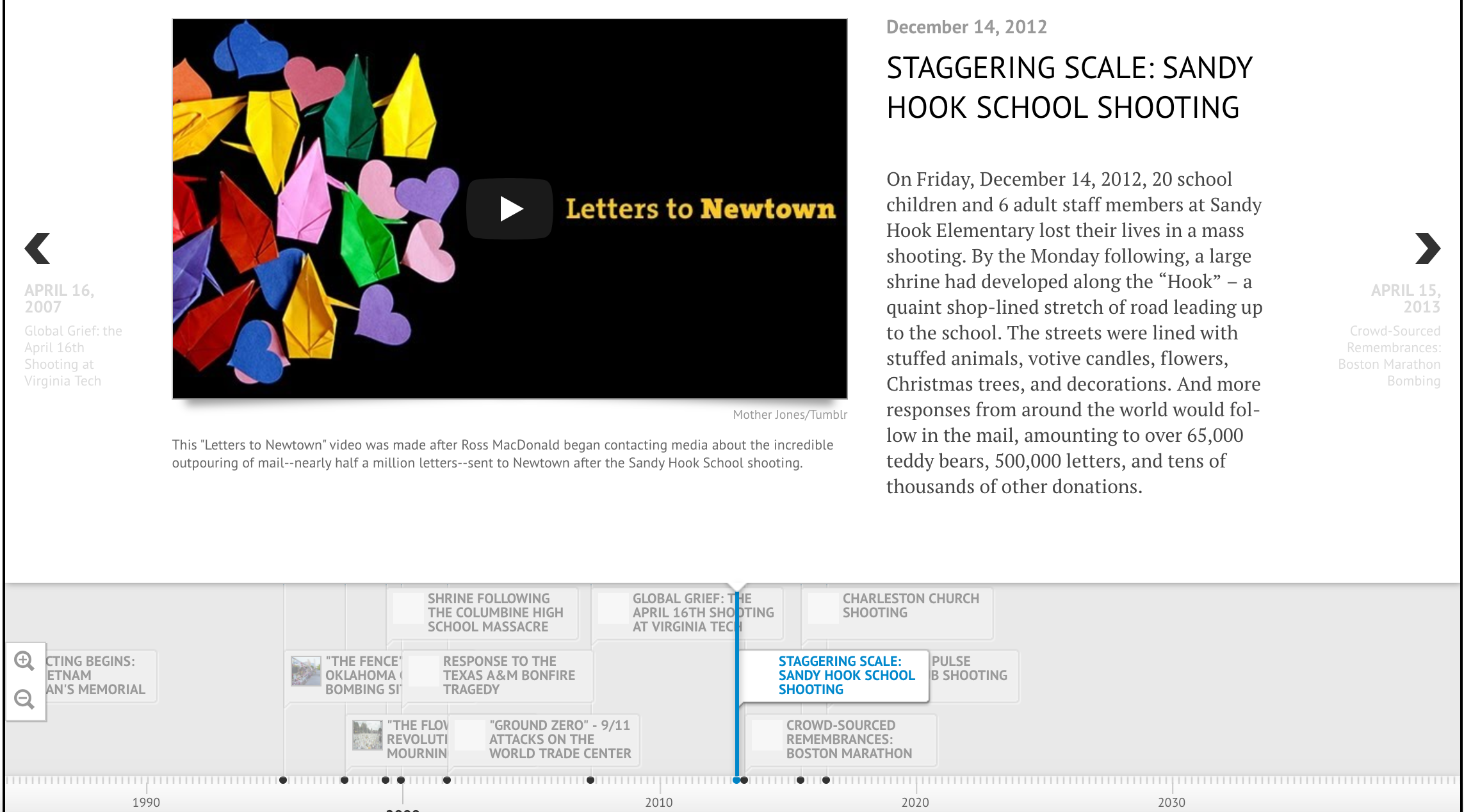
The use of the timeline above provides useful information about the severity of other mass tragedies as well as the Sandy Hook tragedy itself being on the timeline also. The Story of the Stuff uses an interactive timeline provided by TimelineJS, an open-source, easy to learn tool that allows for the easy organization of time and events. Using this timeline allows the reader to compare the relief efforts of Sandy Hook to the relief efforts of the OKC Bombing, Columbine High School shooting, etc.
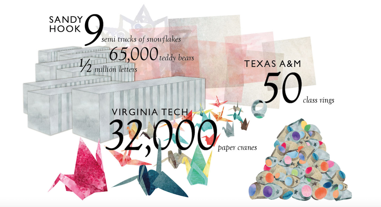
The projects main goal is to share the goodness that is unified among people when tragedy strikes. When a horrific event such as the Sandy Hook shooting occurs, the public are quick to help with the grieving process. By navigating through the site, you will learn that the town of Newtown was heavily unprepared for the mass amounts of gifts and other physical items that show condolences. The image below represents the amount of gifts the town received only days after the incident.
By digitalizing this project, it emphasizes the idea that with tragedy, the best part of people shines bright. No conflict or disagreement can hinder the support people give to one another in times of grief and suffering.
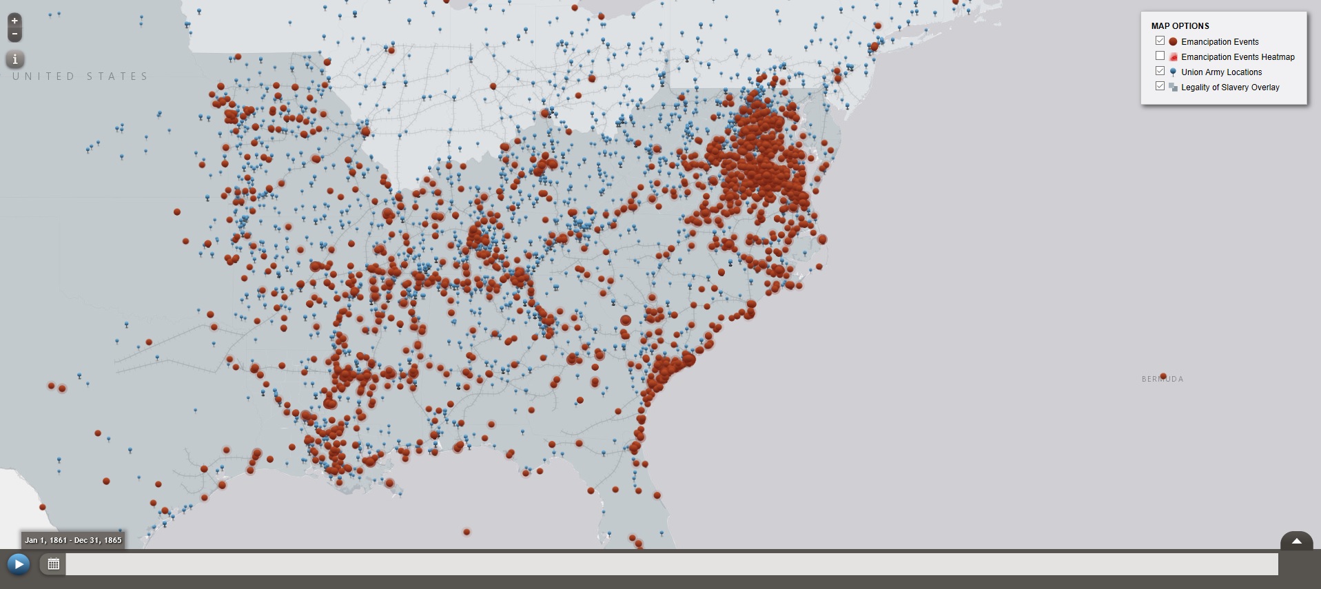
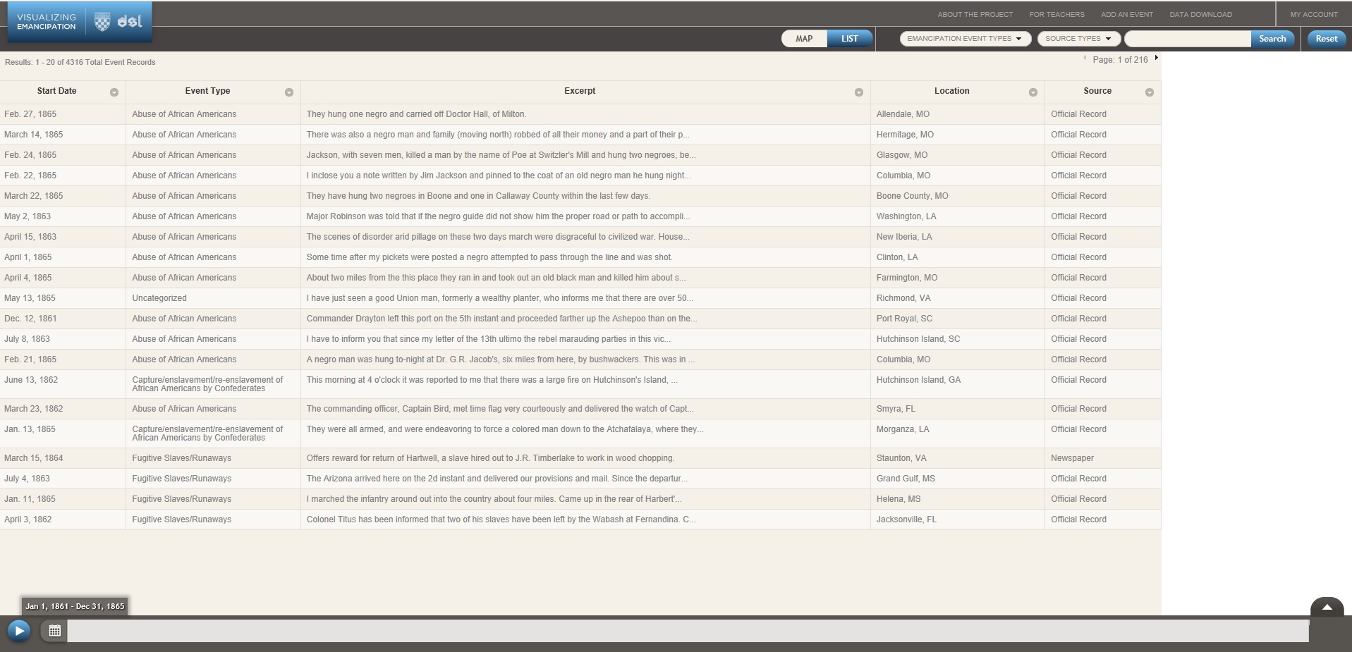
“Visualizing Emancipation” provides a detailed map of all known locations in the U.S. where a slave was emancipated in the Civil War era. This project in particular has benefited greatly from being created digitally, as it provides an interactive, simple to use interface for finding a plethora of information on emancipated slaves.
The project consists of a map with a number of red dots on it, each representing a location in which a slave was emancipated. In addition to the red dots are blue markers that represent the Union forces as they advanced through the confederacy.
These marks serve to show the relationship between the advancement of soldiers, and the increased emancipation rates.
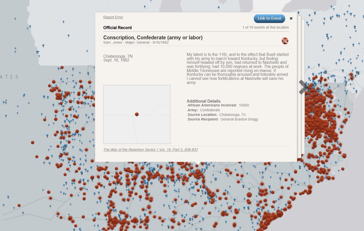
The project’s goal is to provide a record of emancipations as they occurred throughout the U.S., while also providing a way to visual the location and frequency of these emancipations. The project advances the humanities work of organizing cultural events, analyzing historical events, and exploring relationships between events and places. The project advances a traditional humanities aim because the digital interface of the project allows the information to be organized in a way that is much easier to read and get access to. Rather than looking through numerous books to find emancipation records, you can just click on a dot on the map and it’s right there. The project utilized XML encoding, javascript, OpenLayers, and GeoServer.
While it is impossible to fully capture every single act of emancipation that occurred throughout the time period, the project does an effective job in displaying the information in an easy to understand manner, that is packed full of information on the events.
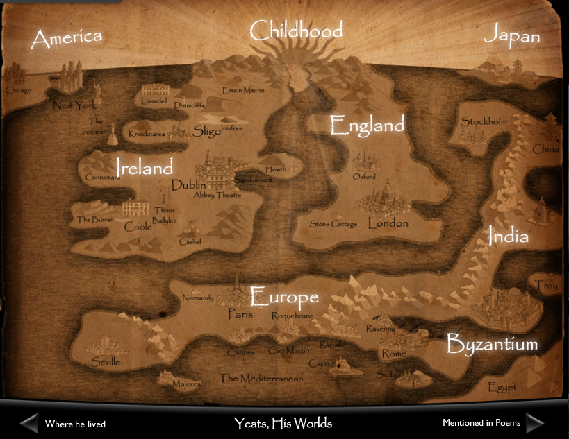
Interactive Home Screen of “Yeats, His World,” National Library of Ireland
The storymap “Yeats, His World” from the National Library of Ireland is a prime example of how interactive mapping can imbue our understanding of an author’s connection to place. The map, which is part of a larger digital (and physical) exhibition on Yeats, organizes photos and biographical information on Yeats by country (and then, region) so users can explore the poet’s involvement with different areas of the world.
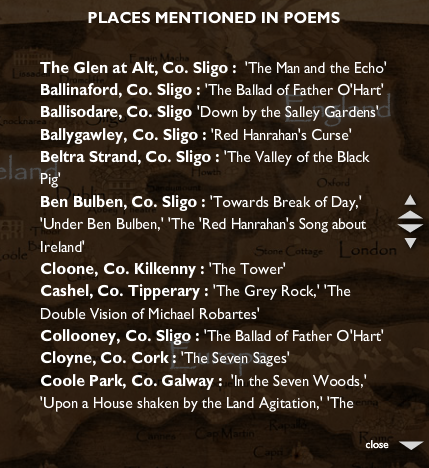
I found the map most informative for two central reasons: 1) the homepage shows the breadth and extent to which Yeats influenced different regions globally 2) it was useful for showing the relationship between select Yeats’s poems and specific locations. The website contains a key (which you can access by clicking the hypertext “mentioned in poems” on the bottom right, which lists each poem and a corresponding place:
“Mentioned in Poems”
This form of spatial learning is particularly important for an author like Yeats, whose poetry often centers on specific places in rural and urban Ireland. The map provides an image, for instance, of Yeats’ tower at Thoor Ballylee, a focal point for many poems in his collection The Tower.
As much as I appreciated the maps’ information, I did see some limitations in the design of the website. My main criticism is that it’s not easy to access the page where readers can navigate “Yeats, His World.” In fact, I doubt I would have found the project at all had I not seen it in the physical exhibition in Dublin. This is because the map is embedded as a child page in the larger digital exhibition on Yeats. Several instances (including twice during my own presentation, regrettably) I couldn’t access the childpage I needed at all, despite going through the same set of steps I had used to get “Yeats, His World” previously. Another issue I had with the map is that the design is crafted to look like an older, vintage map (most noticeably in the yellow coloring and torn edges at the sides) which I found a little corny considering the map actually uses a sophisticated digital interface. These criticisms aside, though, I felt the site was a useful template for my work in mapping out a digital biography to show how a historical figure intersects with different global regions.
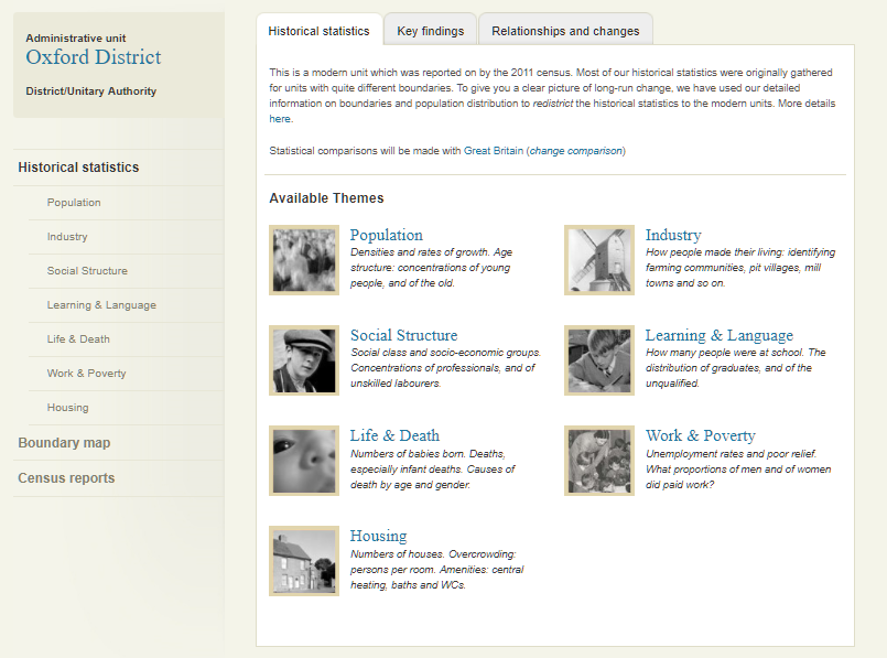
A Vision of Britain through Time, a digital project based at the University of Portsmouth, aims to illustrate social and geographic changes in Britain’s counties over time by utilizing records and maps. To quote their official mission statement, the project “brings together historical surveys of Britain to create a record of how the country and its localities have changed.” A Vision of Britain was created by Humphrey Southall and the Great Britain Historical Geographical Information System.
Statistical Atlas :
A major aspect of A Vision of Britain is to demonstrate trends in the British populace through charts and tables. This information can be utilized in a number of ways by researchers, for instance in looking to make predictions about a certain facet of society based on its history.
Once a location is selected from the Main Page, such as Oxford in the example to the left, a range of topics are presented. Categories such as housing statistics and local industries, drawing their data from census records and local databases, all contain information as far back as 1801.
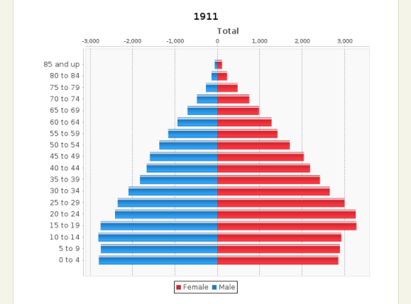
From there, a researcher can select a category to dive further into. Following the Oxford example, if one were to click on the “Population” section, a number of statistics and census records would show up. The main feature of these categories are the charts generated automatically based on the information, with data as far back as the 19th century. For example, this graph on the right shows the age and sex structure to age 85 and up for Oxford in 1911.
These charts on A Vision of Britain were generated using JFreeChart, an open access charting software.
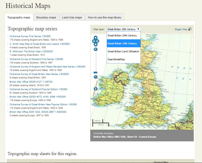
Historical Maps :
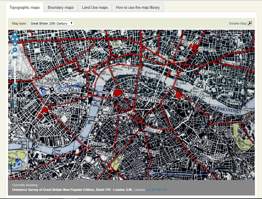
Another feature of this project is their historical maps section. Researchers are able to interact with a map of Great Britain, composed of dozens of different maps, for an interactive experience spanning centuries.
The interactive map of Great Britain is seen on the right. The maps that make up the whole presentation are listed on the left. Notice that users are able to change time periods from the drop-down menu above.
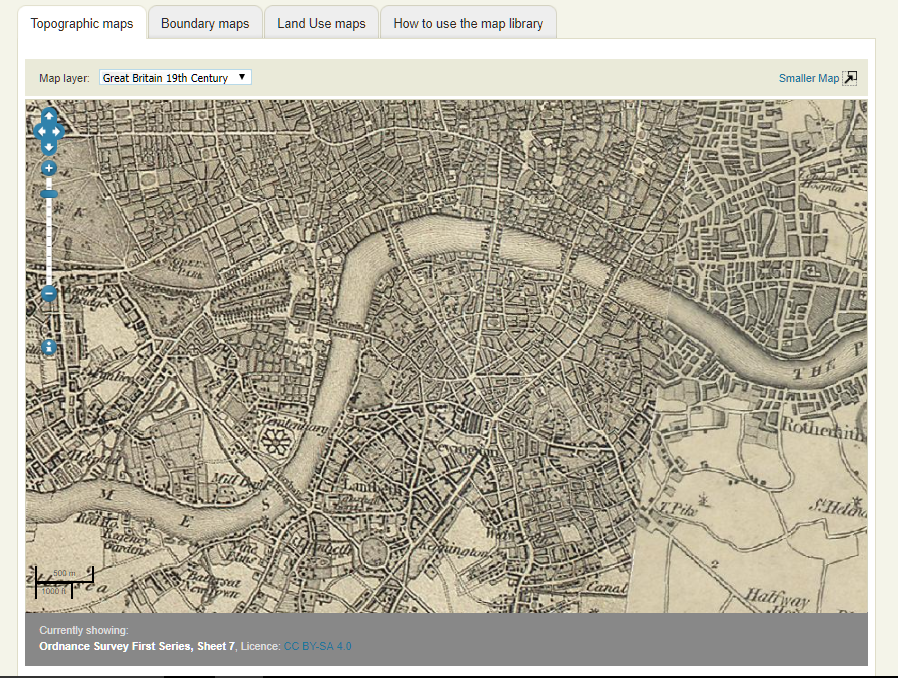
Since this project is digital the researcher can utilize the information on hundreds of maps placed together to gain a better understanding of a specific area instantly. For example, a researcher can analyze the differences between 19th and 20th century London simply by selecting another map configuration, as seen below.
A Vision of Britain is doing traditional humanities work as usual, but with the added element of being digital. Southall and his team are pulling data from primary sources, such as maps and census records, to provide the information on their site. Researchers are thus able to interpret this primary source data to further explore the relationships between people and their environment; in this instance, British citizens and the various localities across the island.
Being a digital project, as opposed to more traditional routes, allows for more interaction on the part of the user. Charts are generated to give them seemingly endless statistics on a range of topics across British society. Not only is the raw data given, but also the sources are listed and instantly accessible, something not possible in articles or books. Additionally, researchers can quickly move between maps across centuries and from different sources to find exactly what they need. When they are done, they have the option to download the maps for future use. In fact, the user can download most of the website’s open access software and content for use on their own personal projects.
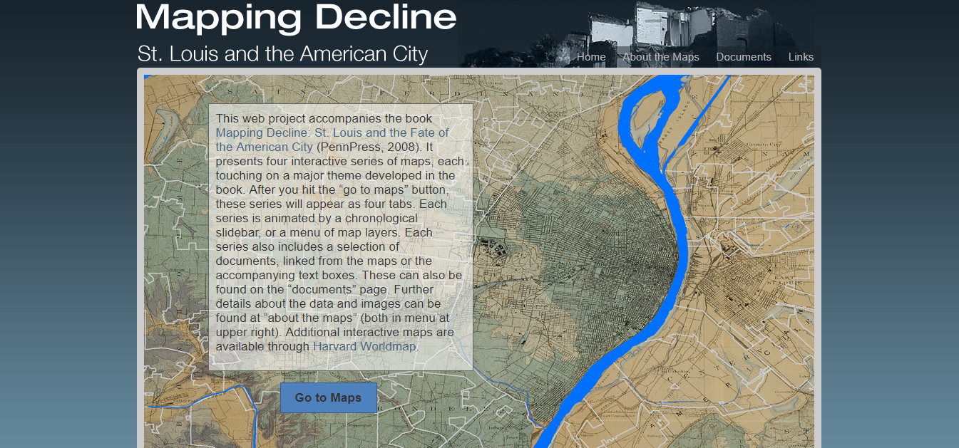
Mapping Decline: St. Louis and the American City is a digital mapping project connected to the book of the same name by Colin Gordon. This project uses various programs, particularly ArcGIS and Social Explorer, to explore the relationship between people and a place (a common theme in traditional humanities) interactively.
Home screen for Mapping Decline.
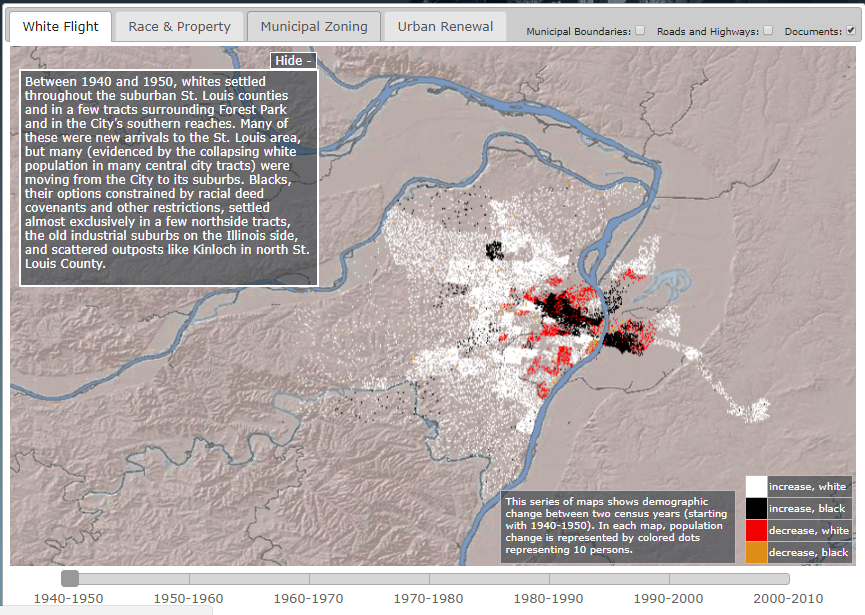
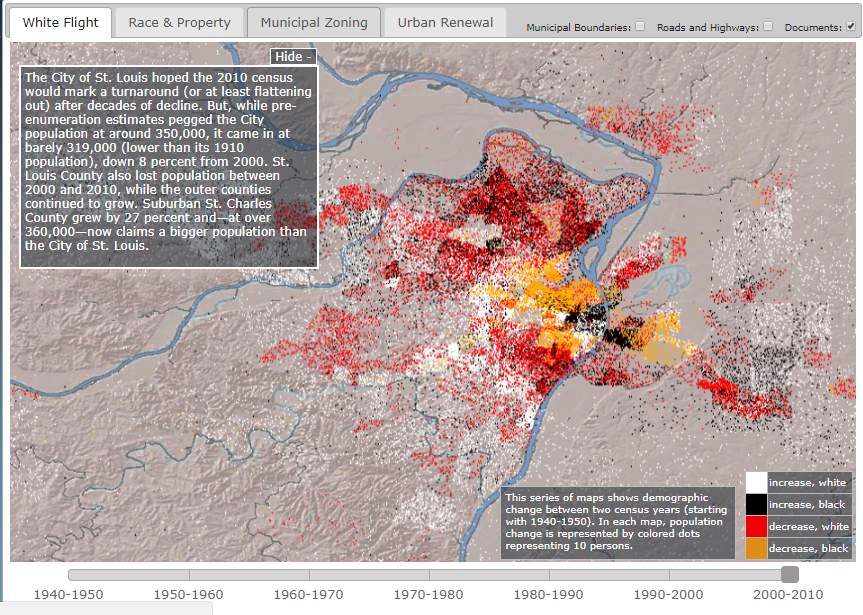
The project includes four maps, each connected to a theme from the book. It is not necessary to have read the book to understand these themes, as the site gives background information on each one. The book and digital project’s main goal is to explore certain demographics—in particular race and housing—in St. Louis over time. Mapping Decline specifically explores four themes: White Flight, Race and Property, Municipal Zoning, and Urban Renewal. Except for Race and Property, all maps include a slider bar in order for the user to see change in each topic over time. For example, the White Flight map includes four types of data: increase in white and black populations, and increase and decrease in white and black populations from 1940 to 2010. With the slider, the user can interact with the map and see the change in populations in certain regions for the specific time period.
Slider for the “White Flight” map.
This interactive portion is one of the aspects that separates this from a traditional humanities project. Maps are often used in traditional humanities to illustrate certain concepts, particularly the relationship between people and places. Maps help the audience to visualize how a community interacts with its region. Digital maps, like those in Mapping Decline, have the added component of being interactive. Having the slider allows the user to flip between data from different time periods quickly. Seeing the data this way helps the audience to visualize the events, see patterns more easily, and bring the historical events to life.
Beginning and end time periods for the “White Flight” map.
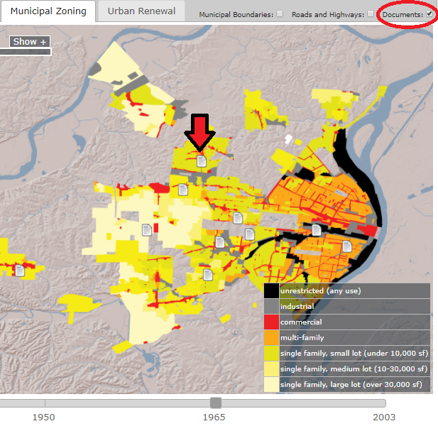
This project, since it is digital, can also reach a wider audience. One reason this project could reach a wider audience is because it is hosted on the Internet, which allows anyone with an Internet connection to access it. Another way this project could reach a wider audience is because, with it, Gordon can spread the message from his book in a condensed form. Instead of having to read the entire book, audiences can pretty clearly understand the ideas (or at least the data) Gordon covers in a much shorter amount of time. The project also includes links to documents which are important to the topic, something that is not offered by simply reading the book. In traditional humanities, you would have had to look up these documents on your own. Mapping Decline, however, allows you to access these documents with one click. A tab at the top of the site leads to a page talking about the documents, which includes links to digitized versions of the documents. Mapping Decline also offers the option of seeing the documents on the map itself. The user can turn on this option by clicking the “documents” button at the top. Once they are on the map, the user can get to the digitized version of the document by clicking the document symbols. Mapping Decline also has the option to enable municipal boundaries and roads and highways. Both by its location on the Internet and its form as a condensed version of Gordon’s book, Mapping Decline allows Gordon’s argument to reach a wider audience.
Example of documents inserted into the map.
Mapping Decline was created using a few different programs. From what I can find, Colin Gordon, the author of the associated book, did most of the work for this project himself. The three mains programs used were ArcGIS, Social Explorer, and the University of Minnesota’s National Historical Geographic Information System (NHGIS). The NHGIS is a place to find data in file types which can be utilized by GIS systems. The specific version of ArcGIS that was used was ArcView 9.2. ArcGIS is a mapping platform run through ESRI (Environmental Systems Research Institute). The ESRI was founded in 1969 and as of 2014, held approximately 43% of the GIS software market worldwide (more than any other supplier). The other mapping program used to create Mapping Decline was Social Explorer. Social Explorer is only one program offered by the company of the same name. Social Explorer the company has roots going back to the late 1990s and also offers the programs Charts, GeoBuffer, and MapSpice. Social Explorer includes some data access (like the NHGIS) as well as the tools to build maps. As mentioned in the “About” tab of Mapping Decline, some of the data had to be adjusted in order to be mapped. For example, the 1960 data (which had 323 census tracts) had to be adjusted to fit over the 1950 geography (which had 247 tracts) for the 1950-60 map.
Mapping Decline is an example of how interactive, digital maps can help an audience to better understand the patterns in data. Finding patterns in demographic data which relate to larger social issues in a community (such as housing and racism) is a popular theme in traditional humanities, but interactive maps on the Internet, using programs like ArcGIS and Social Explorer, allow for both a better visualization of these spatial patterns and a potentially wider audience.
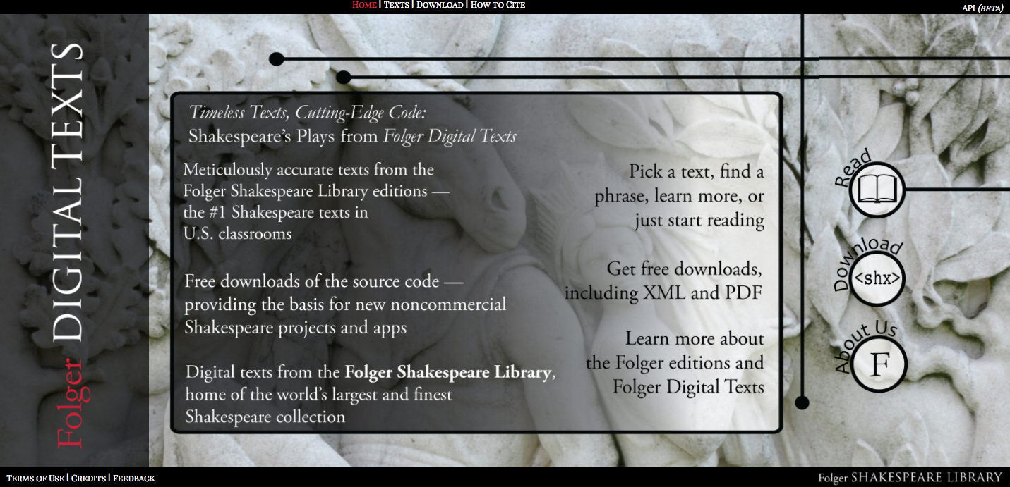
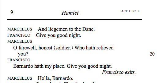
Folger Digital Texts is a project undertaking a very traditional humanities aim – preserving, organizing, and making available Shakespeare’s collection of works – but breaks newer ground with digital tools and a great contribution to the collaborative, open source nature of digital humanities initiatives.
Shakespeare can be found everywhere, to be sure, but these editions are unique because they offer a highly readable, navigable, and interactive text to users. Physical books, PDFs, and simpler websites containing Shakespeare’s work are limited when it comes to these features, which is why the digitals tools the Folger Shakespeare Library implements really shine. Public domain texts with the widespread cultural impact that Shakespeare has are always going to be available, but a project like this ensures a quality reading experience to those who might otherwise lack access to a reliable physical edition or digital file.
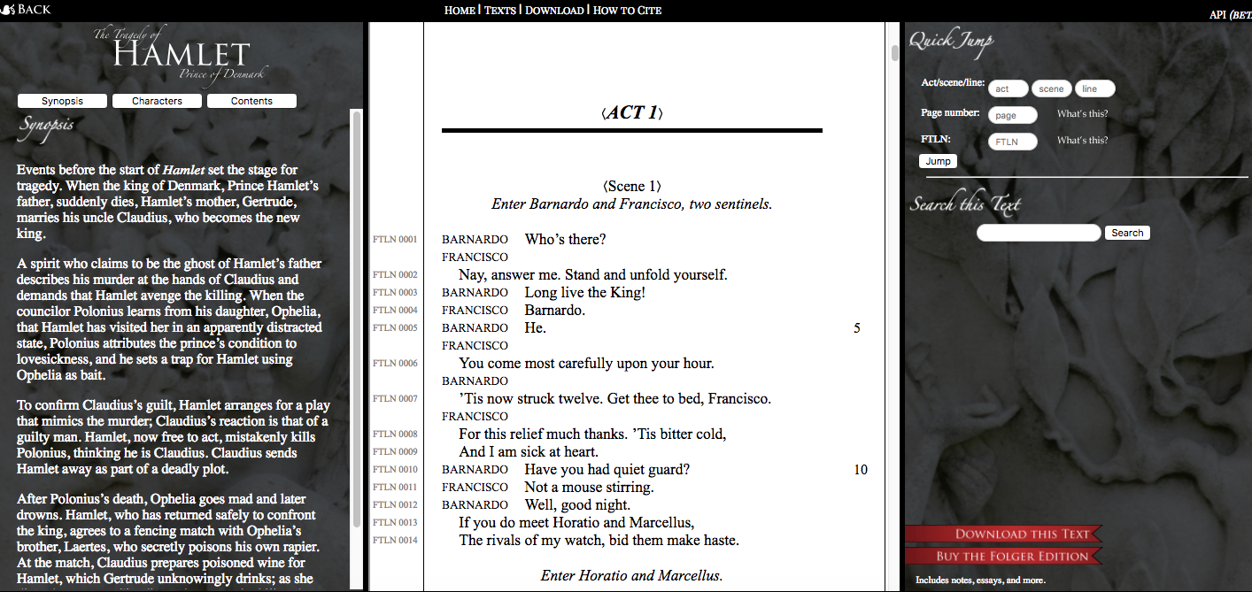
For instance, once you open a play of your choice – let’s say, Hamlet – you are immediately shown a few displays. In the center of the website is the play itself, formatted much like a physical book with a clear, attractive layout. On the left, you have a display of information about the text, which is present throughout the reading experience. You can switch between a synopsis, a character list, and the table of contents of the work. If you have forgotten who Reynaldo is, for instance, you only need to slide your eyes to the left to see that he is Polonius’ servant. If you have been reading Act III for what feels like an eternity and want to know exactly how many scenes are left to get through, again, look to the left. There is no flipping between pages or scrolling endlessly to find what you need here; the tools exist for you to find background information, lines, and scenes immediately.
Furthermore, the text is marked at various points to indicate some of the changes between versions of the play; wherever there is a square bracket one can hold their cursor over, a note will appear with information about the version this word or phrase came from. This illustrates how scholarly work has been carefully encoded into the edition, although this feature is fairly limited in this project – it would be fantastic to have more complete scholarly notes strewn throughout the text. For a free online resource, however, this may be a tall order.
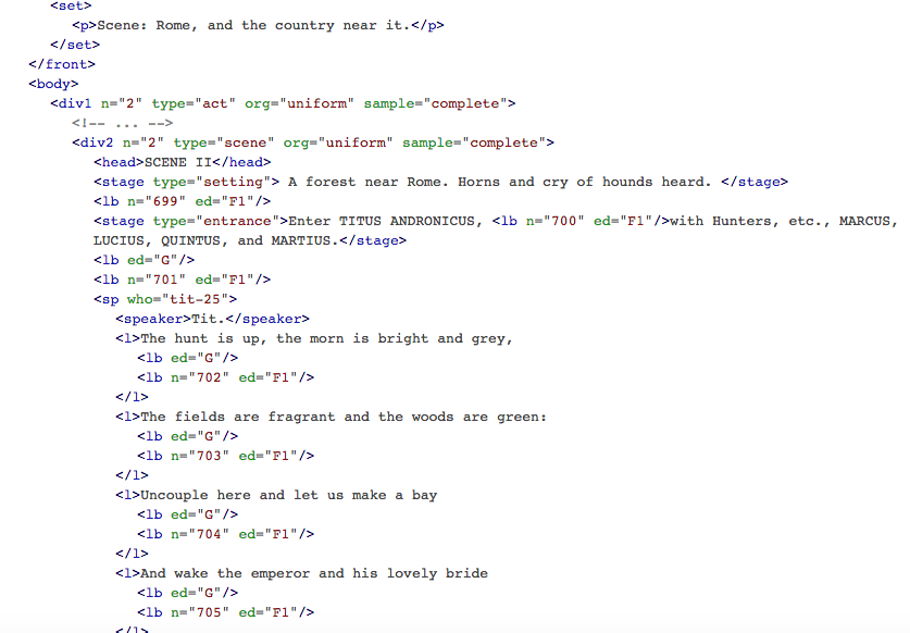
Projects such as this can be achieved through the use of TEI (Text Encoding Initiative), a language developed from XML that presents humanists with a general set of guidelines for digitally encoding texts. A thorough explanation of TEI can be found here, but you can see the process that may have been undertaken to encode Titus Andronicus in one of this website’s examples, including some important elements:
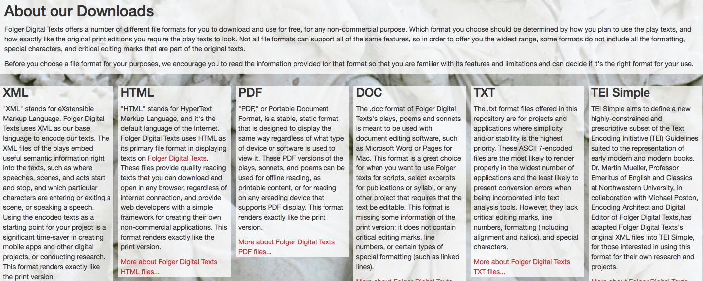
Outside of creating an accessible and dynamic collection of Shakespeare’s works, Folger Digital Texts also has another purpose, one that marks it as even more unique from traditional humanities projects. For every play, there is an option to download the complete, edited text in seven different file formats: XML, HTML, PDF, DOC with line numbers, DOC without line numbers, TXT, and TEI Simple. This turns the project into an excellent, centralized source for those accessing Shakespeare’s work to use in further digital projects – maybe humanists can pull a file to perform textual analysis of a play, examine relationships between Shakespeare plays and more recent works, or develop a digital edition with a different aim.
This spirit of open collaboration is a bit different from the type of collective work traditionally done through scholarly references, panels, and journals. Scholars can use this project to build many others simultaneously, freely, and easily (at least to the extent that they can begin with a reliable text file). There is no need to build a digital edition of a Shakespeare play from scratch for further initiatives when a TEI Simple file can be accessed at the click of a button. The Folger Shakespeare Library has recognized a need to share its labor with other digital humanists, and this focus on the growth of the field is very promising for those of us just getting started.
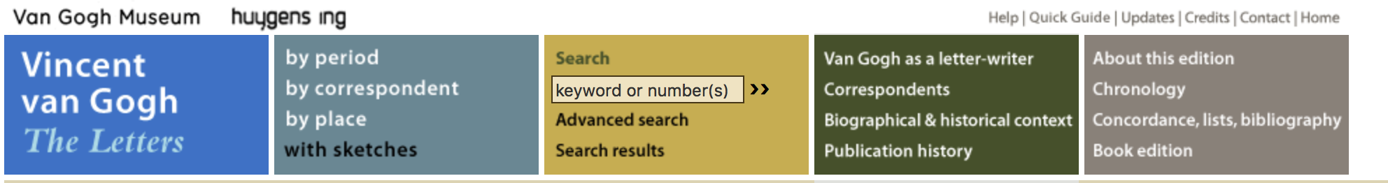
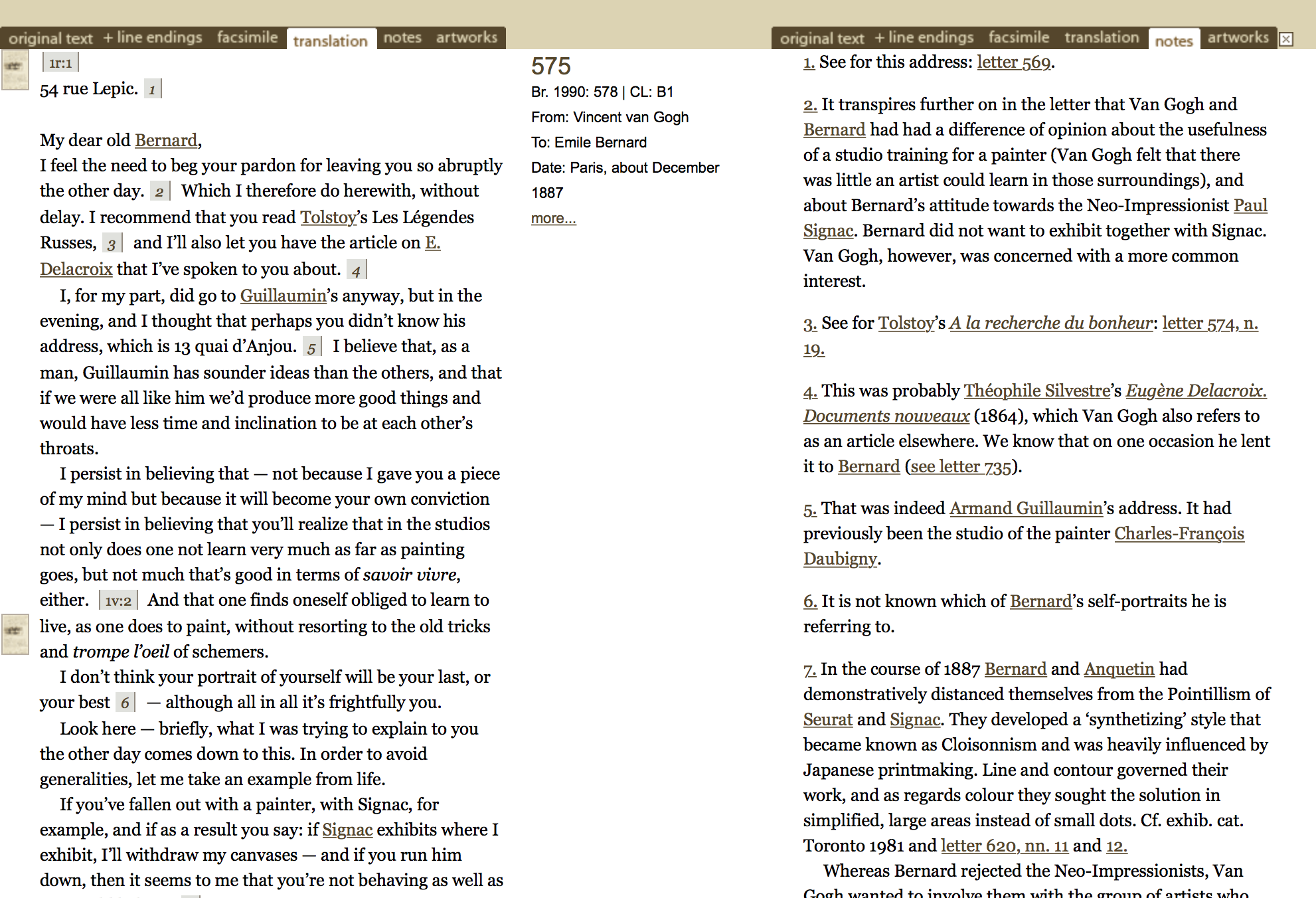
For my project, I looked at the letters of artist Vincent Van Gogh. The letters were compiled in different ways such as by time, correspondent, and location.
options to view the letters from different contexts. Also shows all of the options available to the reader.
In this way the digital project provided more information to the viewer than the original book did which only contained letters in chronological order. The program also provided automatic translation of the letters and gave the viewer the chance to compare the original to the translation. The program used XML format and more specifically TEI to achieve its purpose.
Different softwares used to create website.
The program also contained metadata that gave extra information about the letters that was not present in the book and it provides background information and historical information on Van Gogh himself along with all the other people that he corresponded with.
Analyses of letters and extra context information can be found on the right hand side of the page.
Because it is digital it is quick and easy to see the connections between the letters from different aspects like by location and time. The program also gives the viewer a way to explore different relationships between Van Gogh and his correspondents and it analyzes and interprets the letters which it doesn’t do in the book.
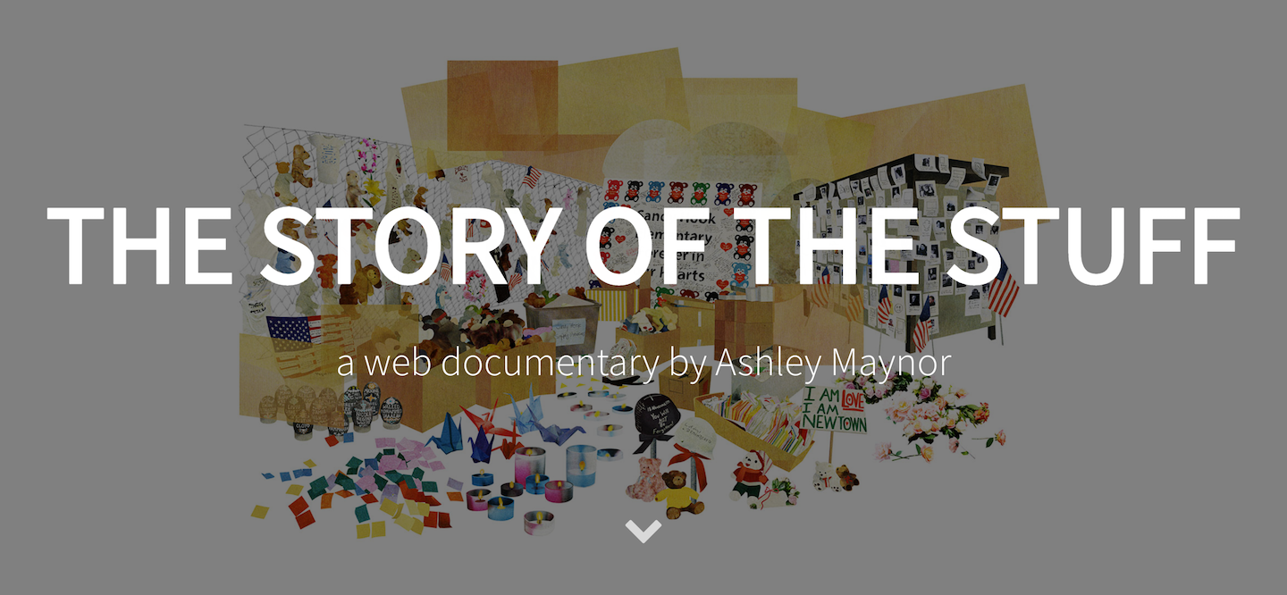 “The Story of the Stuff” is an interactive, multimedia project that provides insight to the relief efforts that the people of Newtown, CT suffered on the day of the Sandy Hook Elementary School shooting. This project focuses on the items donated to Newtown and the overwhelming support that came with those items in a time of tragedy. This project greatly benefits from becoming digitalized because it shows, through the use of pictures, videos, interview recordings, and a timeline of other related events, that the information is readily available in the most easily accessible way.