The Ecological Benefits of Good Advertising

This project is live at https://jacksnyderdh.wordpress.com/

The purpose of this project is to show how the Metropolitan Transit Authority (MTA) builds a community between a company and its consumers through carefully crafted advertisements in a way that benefits both the MTA and the riders. I analyze details ranging from the implications of personal pronouns to feelings brought about by background art, all of which work together to make riders feel like part of a community and more environmentally aware of their actions; this in turn promotes riders’ continued use of the subways and reduction of their ecological footprints at the same time. This analysis is worthwhile to both consumers and companies alike, as consumers can become more consciously aware of the impacts felt from different styles of advertisements, and companies can be prompted to change their style of advertising from a toxic consumeristic cash-grab to a more positive and mutually beneficial model.

This is essentially the traditional humanities aspect of my project. Examining how a corporation can use advertisements to influence its customers is useful to corporations and consumers alike, and shows how interactions between different groups of people can be mutually beneficial. My project reinforces the importance of community in maintaining healthy and ecologically efficient lives, which benefits everyone involved if practiced truthfully. As a traditional humanities project would, I break down and compare elements from various works in order to convey a pattern in messaging that the MTA uses to the mutual benefit of the company and its riders.

However, there are many elements of my project that distinguish it from a traditional humanities project. Along with a photo of each advertisement, I made smaller edited versions of their elements that I discuss, and integrated them in the text. This allows users to directly compare my analysis to the related elements without having to move back and forth around the page and search for each specific element in the photo, all while potentially forgetting what the analysis was or losing their place in the text.

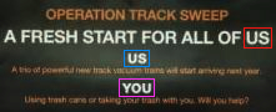
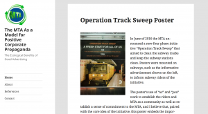
For example, the photo to the left is from the Operation Track Sweep poster. I color coordinated words in the photo with their reference in the text to make the context less confusing (e.g. when discussing us or us) and to make it easier for users to identify which elements of the advertisement are being discussed.

Each advertisement being in its own blog post allows for a certain level of interactivity between the users and the content, where users can comment on each advertisement’s blog post or share the posts to social media.

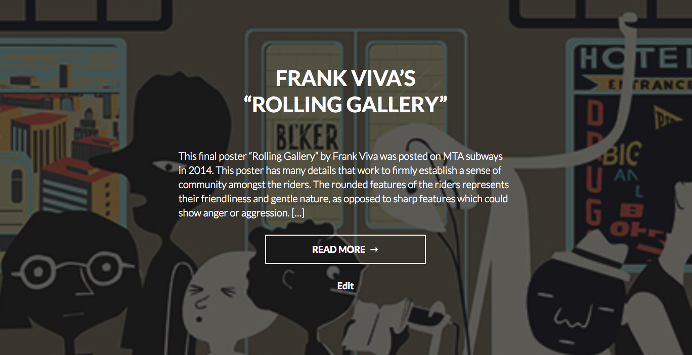
I have embedded YouTube videos within a couple of my posts and analyze the contents of the videos as they relate to the advertisements. For example, I have the Operation Track Sweep poster and its analysis, as well as a YouTube video that is by the MTA and about the Operation Track Sweep initiative. I draw parallels between personal pronoun use in the poster and in the video, which establish a community between the MTA and its riders and promotes keeping the subways clean. Having a video able to be played within the blog post allows users to easily compare the advertisement to the video while taking the provided analysis into account. A traditional humanities project would not have access to such a dynamic interface for analyzing video content and comparing videos to text and other photos.

Other distinguishing elements of my project are discussed later with my choice in WordPress theme.

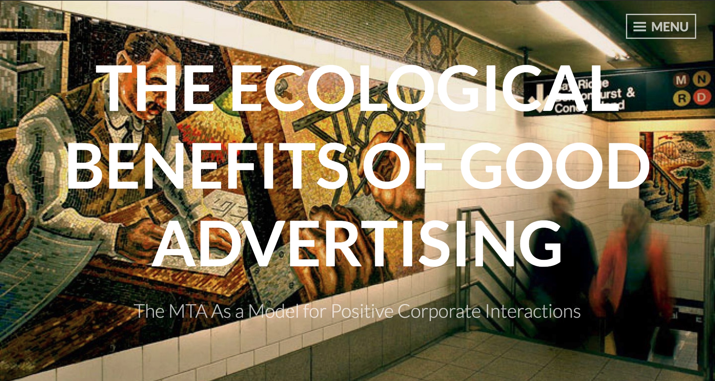
My project’s homepage prominently displays the title and subtitle of my project (shown at the top of this post). Underneath are snippets of each blog post with the analyzed advertisement in the background. The title of the piece, the beginning of the text analysis, and a portion of the image gives users a taste of the advertisements that they will read about in each blog post, which makes the posts seem more enticing. The background scaling also changes dynamically depending upon window size and browsing device, which keeps it well formatted across multiple platforms.

Each blog post can be clicked on from the homepage. Some of the blog posts include interactive features, such as embedded YouTube videos or slideshows paired with analysis. At the bottom of each blog post there are options to move to the next or previous blog post. From anywhere on the website, a menu on the top right can be used to jump to any page on the website, including the home page, about page, references page, contact form, and any of the blog posts. I depict and discuss more about the menu button later in this post.

I had initially wanted my project to be a single-page experience, where a user would scroll through the project from top to bottom, as I believed this would be a very intuitive and simplistic user interface. I found difficulties with this format as I worked, such as the advertisements being so distinct from each other that making a single-page experience feel cohesive was nearly impossible, especially so after adding multiple smaller images of elements from each advertisement. After a discussion with Dr. Schacht, I realized that such a format is not very different from a traditional humanities project – the information was presented in a very simplistic way that could have just as easily been printed out as an essay.

I decided to move away from the single-page experience in order to take advantage of WordPress. Dr. Schacht had noted several ways that I could more meaningfully present my information with different WordPress themes, so I changed my theme to make the project more visually engaging and lend itself better to the visual analysis that I conduct. I settled on the theme “Intergalactic 2” for a number of reasons:

Something Dr. Schacht mentioned, which the theme Intergalactic 2 does well, is the ability to have a featured image behind posts on the homepage. On my project you can see a portion of the discussed advertisement in the background of each of the posts’ panels. The title of the piece, the beginning of the text analysis, and a portion of the image gives users a taste of the advertisements that they will read about in each blog post, making the posts seem more enticing. The background also changes dynamically depending upon window size and browsing device, which keeps it well formatted across multiple platforms.

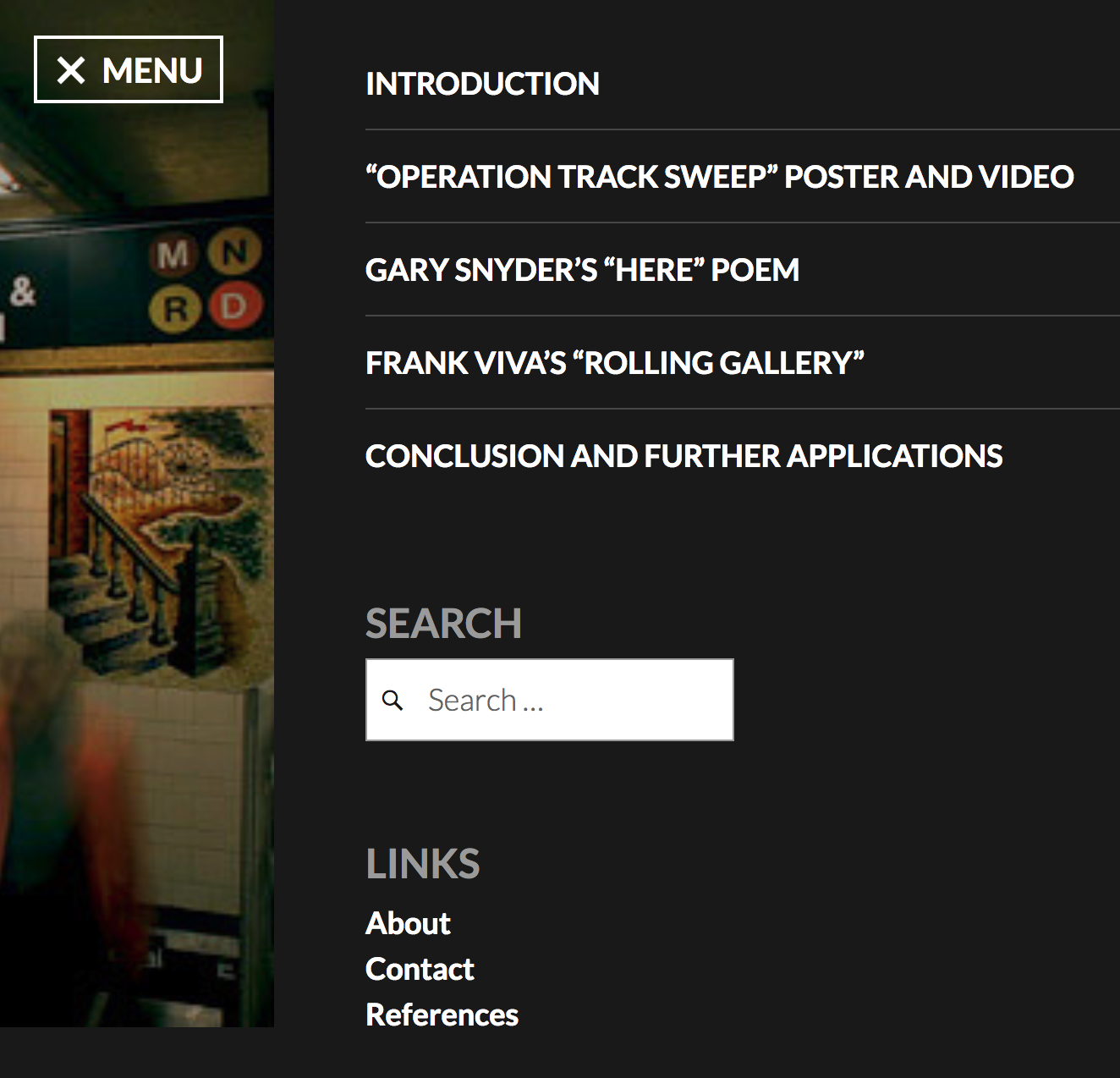
An aspect of this theme that I feel conflicted on is the navigation menu. It slides out from the right side of the screen in an elegant way, and the menu itself is aesthetic and functions well with the short list of posts I have in my project. The only issue is that users can easily miss the small “MENU” button on the top right corner of the page. The menu button does not scroll with the page, so a user would have to scroll to the top to find the subtle menu button, which is not intuitive. There is no way to change the design of this menu button, so it is a flaw of the theme that I must deal with for now, and will account for in future projects.

Over the course of working on this project I learned a lot about web-design, digital tools, and overall about the humanities as an enterprise. Switching my website’s theme halfway through my project was not an easy decision, but it allowed me to realize the difference between what I had imagined in my head and what was viable for implementation. Over the course of this project I had tried out other online tools, such as HTML map tags to make sections of photos interactive, and StoryMapJS to try a timeline sequence approach to photo analysis, and despite not using them in my final product, I learned about the capabilities and limitations of each of these methods: HTML map tags are ancient and clunky, while StoryMapJS does not have the ability to do photo analysis that I had wanted.

I have learned that humanities is an ever-evolving field as it moves into the digital realm, with more tools available now than traditional humanities projects could have ever had access to. Digitization allows for deeper analysis with online tools, makes it easier than ever to share projects with others who may be interested, and propels the humanities into the 21st century.

Progress: The MTA as a Model for Positive Corporate Propaganda

My website hosting this project is live and can be viewed at any time at https://jacksnyderdh.wordpress.com/

My projects purpose is to highlight a subtle aspect of New York City life that I find intriguing – the MTA’s advertisements. These advertisements work as a positive form of corporate propaganda to build a sense of community amongst riders, reinforce continued use of the subway, and unconsciously and subconsciously promote better ecological habits. This project examines a handful of advertisements to break down how the MTA does this and the impacts these advertisements have on riders. I also conclude my project by suggesting that others could emulate the MTA’s types of advertisements for a number of reasons that benefit both the company and its target audience.

This project adapts traditional humanities work by analyzing the inner workings of how the MTA establishes a unified community of commuters, exposing and unpacking some factors that hold the subway riders together in the community, and suggesting how this community could be replicated by others.

Traditional work in humanities could not analyze photos like I plan on doing in this project. The digital tools I am using (WordPress, StoryMapJS, Photoshop) allow me to make an intuitive platform for graphical analysis that could not be achieved as well on a non-digital platform. The one-page homepage format of navigating my topic also allows for more fluid ingestion and perusal of the information contained than could be grasped from skimming a research paper or a book. Aside from benefits to presentation, these digital tools allow for a wider sphere of access to my project. In paper format, it would be difficult to find a publisher to spread my ideas to others. An easily sharable website allows for widespread distribution and direct engagement with the readers through comments or my contact form.

I had touched on this earlier, but by the end of my project I hope that my readers can understand how the MTA builds and maintains such a strong and ecologically aware community through advertisement, and can be able to see similar elements and methodologies in other types of advertisements in order to appreciate them as positive. The project concludes that other companies can attempt to replicate such a style of positive corporate propaganda with advertisements on the internet or on television to the benefit of the company, their consumers, and the environment.

There are a lot of toxic commercials in our world and on the internet that leverage stereotypes, gender norms, unhealthy attitudes, or other unethical means to sell a product. I hope that through this project, readers will be able to differentiate positive advertisements from toxic advertisements, understand how positive corporate propaganda can benefit both the provider and the consumer, and will leave with an increased ecological and communal awareness that positively influences their lifestyle and mindset.


The site is designed to be fully experienced from the homepage, although there is a quick links tab on the left side of the page to provide hyperlinks to the introduction, each individual advertisement, and the conclusion. I chose this homepage format because I think it lends itself to the natural progression of analyzing photographs as well as keeping all the main information centralized and easily digestible.

The about section will be filled with a general outline of my process through making the website and the final list of tools used. The references tab contains MLA formatted references to the photos, informational resources  and digital tools used throughout the project. The contact section is a simple form to send me an email.

When clicking onto a single section from the homepage, the site redirects you to the individual post and allows for sharing options, leaving a comment or response, and shows the titles of both the previous and next section, with links to each respective one’s individual post. I think its important to have a comments section for each individual post so that readers can interact with me and each other on the topic of the subject matter. Each of the posts can also be edited and updated if there is something worth adding later on, making it easy for me to update the website and keep it up to date.


One problem I had was the need to find a good theme in WordPress that lends itself well to a one-page design and allows for showcasing photos in that one-page design. There are a finite amount of free WordPress themes, and it is quite easy to preview them with posts you have made already, so I was able to privately upload a number of posts and see how various formats handled the simple text and photo combinations. I eventually settled on the WordPress team’s theme “Twenty Fifteen” due to the simple solid color background, clean side bar, and the clarity each post had from another while showing the full text and photos.

Another problem was figuring out how to annotate my photos in a more intuitive and interactive way than just referencing parts of the photos in the text. I initially considered using an image map generator or the HTML

tag, although these are highly antiquated, non-user friendly, and unintuitive methods for annotating photos. Next I considered simple photoshopping of the photos with arrows or isolating elements and inserting them in-text. This can always be an idea I return to for highly important elements of the advertisements, but working with these pieces of the photos while still editing the text analysis for each photo makes it difficult to keep re-editing and orienting the elements properly in the text as I develop my ideas. Finally, I had tried using StoryMap JS earlier  in the semester to make annotations on my photos instead of a map, but I found trouble with the interface and could not figure out how to replace the map. I picked the effort back up after Dr. Schacht showed me a website proving that this was possible. I am currently making no headway on getting this to work, but it is ideal for what I want to do so I will be figuring it out.

A final problem I am having is finding good stock photos to include in my about section, references section, and contact form. Right now they are the theme’s default photos, but I plan on finding different cool stock photos related to subways or the environment or communities or something of the sort. I did use photoshop to combine a photo of a green earth and the MTA logo to make a logo for my site (shown left) which is featured on the top left of the homepage and in the site’s icon.

Through working on this project I have gained a better sense of how to work with WordPress, learned what HTML

tags are and why they are obsolete, and developed my understanding of aspects of graphical construction in building an easy to browse website. I also learned that there is a lot of information on the internet to help with any digital tool you need, so resorting to a google search is nothing to be ashamed of.

Around DH in 80 Days

Around DH in 80 Days” is a Jekyll site made to collect interesting Digital Humanities projects from around the world and share them with a larger audience in an accessible and interesting format. The title is a play on Jules Verne’s “Around the World in 80 Days,” and once a day for 80 days, a new Digital Humanities project was shared through an RSS feed, a summary and link were posted on the website, and a dot was placed on a map to show where the project was from.

Projects came from all around the world, highlighting how integral the internet is to sharing and finding projects in the budding field of Digital Humanities despite language or locational barriers that might exist in other more traditional formats.

The website also benefits from being a Digital Humanities project over another form of humanities project because the RSS feed and blog format kept users coming back each day to check on the new Digital Humanities projects. This kind of suspense and anticipation for new content would be difficult to create in a book – one could just flip to a random page and see a new Digital Humanities project. Also, interacting with the projects would be cumbersome in a traditional humanities format – having to type a long website address from a book could be enough of a deterrent to turn users away from delving further into the Digital Humanities projects described.

The dots on the map are interactive – clicking them directs the user to the blog post from that location. This provides multiple ways for users to scour the different Digital Humanities projects – chronologically, locationally, or by selecting the projects with interesting titles in the list of all the projects (what the website calls “The Full Journey”).


The blog posts themselves are quite straightforward. The day out of 80 that the project was posted on is followed by the project’s title and the actual date the post was published. A brief summary of the project is provided with either a copy of the projects own description, an editorial description, or sometimes with quotes from the authors of the projects after being reached out to for a statement. There are always links to the projects, hyperlinks to related texts when appropriate, and credit is given to the member of the “Around DH in 80 Days” team who found the project and wrote the summary.

The descriptions are interesting enough to hook the reader into clicking through to the project’s website and browsing around a topic they have likely never heard of or even considered before. The large amount and wide variety of projects presented here practically guarantees that any user will find something new and interesting.


In class we have talked about discrimination in the field of Digital Humanities and we watched a clip where a woman stood up for gender discrimination at a Digital Humanities convention. We have also read several pieces about the importance of categorization and representation of minorities/misrepresented groups in the humanities and in Digital Humanities. Around DH in 80 Days shows the power of the internet to increase the publicity of different nations and peoples, and how the internet can be utilized by Digital Humanists to share culturally specific information to the world. This is important for ensuring that everyone’s stories can be told and found by others who can learn from or make use of their information. In my opinion, a more connected world is a more accurately informed world and thus a better world for all.

The website itself could be more interactive and aesthetic, but in the about section the website states that it decided upon a Jekyll website specifically because it is a “simple, blog-aware, static site generator” that would make the website download faster in countries where internet bandwidth might be an issue.

From the intent of the project to the prominently displayed map to its core programmed functionality, the idea of making projects from around the world accessible to the entire world is very well executed and quite admirable.

A collaborator of the site said, while sorting through projects to consider for the website, that the website should instead be called the the “1,001 nights of digital humanities” because there were so many different projects to choose from for the 80 days. While the field of Digital Humanities is still in its beginning stages, there is already so much information in Digital Humanities projects around the world that the creators of the website promote their users to continue looking for more projects: “We hope that you take these [80] selections only as an opening gesture, while we gather the army of collaborators that it would take to do 1,001 of these.”