
For my project I have been working with Professor Behrend’s research on black politicians in the Natchez region after the Civil War. My final goal is to create a map, or at least the prototype for a map, detailing each person Professor Behrend has information on. With the map, I want to emphasize the change in the amount of black politicians in this region over time. Focusing on this increase highlights the grassroots democracy occurring during this time period, which is one of the main concepts in Professor Behrend’s book. I believe that a visualization of this concept (in this case, a map) would further underscore the point, particularly in a form that takes less time to consume and process than a book.
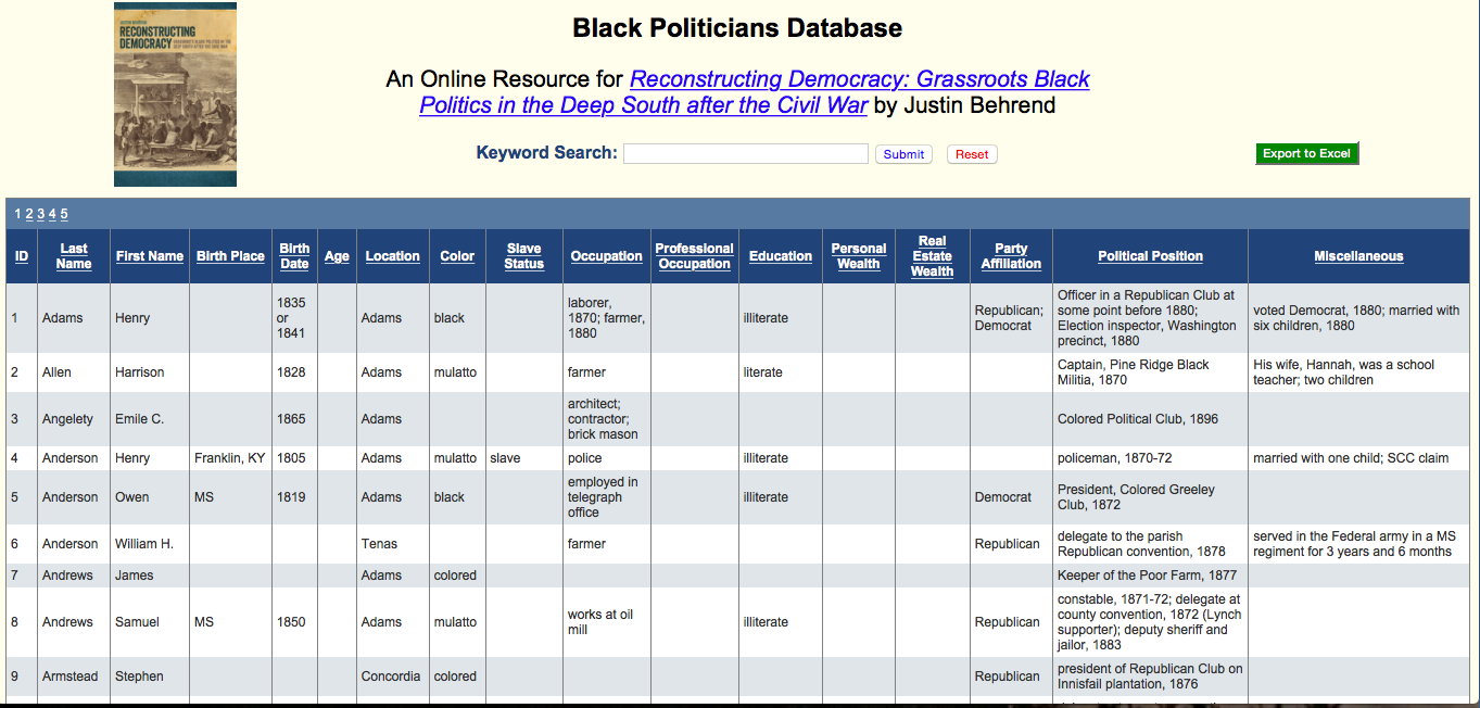
As it stands currently, Professor Behrend has his research on each politician stored in an online spreadsheet. Besides name and political office(s) held, the spreadsheet also includes biographical information such as birth year, county, occupation (besides political office), wealth, literacy status, slave status, and party affiliation.
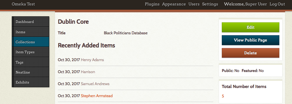
If all works out, I plan to use Omeka with the plugin Neatline and SIMILE Timeline in order to create the map. I chose these programs because of their ability to both create a map and incorporate a timeline. The timeline is important, I believe, because I want to emphasize change in the political circumstance of this region over time.
Installing Neatline has been one of the technological problems I have encountered so far. I have Omeka installed and running on my computer, but Neatline has been more of a problem. Apparently Neatline can be difficult to work with, so in order to deal with this Kirk and I have discussed getting a version of Neatline to run on a campus computer and doing the work for the project there.
Currently Kirk and I are also working to create a comma-separated value (CSV) file of the spreadsheet data. One of the main problems we have been running into with the spreadsheet format of the data is slight spelling inconsistencies and multiple values in one category. For instance, the spelling of “mulatto” differs slightly between people (due to the different spellings in the original records Professor Behrend was working off of). While a person could understand that it is two different spellings of the same word, a computer cannot without being told. Different spellings have made the data somewhat harder to sort out.
The other main formatting issue occurs when one category has multiple values. For instance, if a person held more than one political office, those two (or three, or four, etc.) are all under the category “Political Position.” The computer reads each category as one value, so if one person was a constable and another was a constable and a delegate, it would not recognize those two people as having had the same position. “Constable” and “Constable and delegate” are completely different values (not overlapping) to the computer. In order to solve these formatting issues, Kirk and I are creating a CSV file, where a comma indicates that what came before and what comes after the comma are completely separate values, even if they are in the same category. This will allow me to work with people who had multiple positions, was illiterate at one point but literate at another, or any other category that has multiple values. This CSV file will be uploaded to Omeka as a collection, which will then be used to create the map.
In terms of the content itself, the major issue is sometimes there is not enough specific information. For instance, the location for each person is a county. This means that many people have the same location, so when I try to map them they are all in the same spot. Instead of looking like multiple points on the map, it simply looks like one point for each county. In order to combat this, what I have decided to do is place each person randomly throughout the county and have a disclaimer somewhere on the map which indicates that this, within county lines, the placement of markers is random. Another content problem is that sometimes we are missing values for certain categories. While most missing values are simply inconvenient—as we would like to be able to provide more information on each person—the one area that is it hindering is if there are no dates for political office. However, this only happens in a few cases so I think if the people without dates for political office are just on the map and not the timeline, the overall trend of an increasing amount of black politicians in the region will still be shown.
While I have run into a few problems so far—particularly on the technical, formatting, and content fronts—I believe they are all issues which can be overcome with help as I move farther along on this project.