My methodology in terms of annotation is largely due to my seventh grade English teacher. I remember her lesson vividly. Circle and define the words you don’t know. Underline key phrases and concepts. Finally, write any opinions you may have to the side of the text. While I follow the majority of these steps, it is the last step, the inscription of my own opinions, that is jarringly lacking from my own marginalia.
I suppose I should first explain that I am anything but a traditionalist when it comes to annotation. I refuse to blemish the appearance of newly printed or well-loved library books. I write all of my annotations in a notebook kept neatly next to me as I read. I can accredit this to my generally atrocious handwriting. I would hate to rent a book and see my marginalia all over it. Arrows strewn across the page linking words to their definitions. Sloppy underlines threading below (and sometimes through) the words that they are supposed to be highlighting. I just can’t do that to books.
There is, however, an exception to this rule. I have no problem whatsoever defacing handouts. I write all over them without a care in the world. Why is there such a discrepancy between books and a Xeroxed-copy of the same material? This may be due to a feeling of ownership that I feel I have with Xeroxed-copies. More than likely though, it stems from my feeling that handouts don’t have the same kind of permanence as books. A handout is likely to remain in two places: in my hands or in the recycling bin. A book, however, is more likely to remain in circulation. I would never throw a book away, but rather would donate it or gift the text to a friend.
This falls perfectly in line with one of the most striking things about my own annotations: I rarely take the time to write down my own opinions. The idea of marginalia being a type of delayed conversation between the author, the reader, and readers to come is particularly interesting when it comes to my case, as I never involve myself in this conversation in the first place. I don’t write down my thoughts on the page but rather exclaim them in my head or even out loud sometimes (I promise I’m generally normal). I never really pondered my reasoning for this until now. I think that it generally arises from an irrational fear of others judging my marginalia. It’s one thing for others to see words that you defined and phrases that you found to be important. It is an entirely different thing, however, to truly write down your opinions on the page. This form of self-identification scares me a little bit. I certainly have lots of opinions but am not as willing to key others in on them.
If I do ever succeed in making my mark in the world, I guess it won’t be found haphazardly scribbled in the margins of a book.
Never have I ever been morally conflicted about whether to write in a book. I just do – I write. The way I see it is that there are usually thousands of copies of any given book, unscathed by marginalia, and it can do no harm to leave your mark on one of the copies’ pages. I prefer pen (ballpoint to avoid smudging), although pencil will do if that’s what I have. There have also been multiple occasions when I have written in textbooks – even rentals (forgive me). I will say, however, that post-it notes are blasphemous. It pains me to imagine taking the time to read and think and write, yet to write on a frivolous piece of paper that will either be lost or thrown away. Ink on paper is bolder, better.
I began annotating in middle school and I still write in books for class assignments, while jotting down important talking points and questions in a notebook. When I read for fun, however, I write only in the book. After I have finished the entire text, I’ll usually make a note, either in the notes app on my phone or in my journal, about my favorite moments and quotations. Mostly, I do this so I can recommend the book to a friend or just share my favorite parts of it (speaking of which, I highly recommend The Book of Joy by the Dalai Lama and Archbishop Desmond Tutu… one of my favorite lines reads, “To linger in the longing, the loss, the yearning, is a way of feeling the rich and embroidered texture of life, the torn cloth of our world that is endlessly being ripped and rewoven.”).
Some of my favorite texts to annotate are poetry, plays, and passages from the Bible. In all three, a lot of my comments turn into questions, and they often go unanswered. I have a sort of shorthand – hearts near things I either relate to or just find beautiful, a half-moon shape (a circle, half shaded in) to portray a notable juxtaposition or contradiction, far too many arrows connecting ideas with my own thoughts, and a fair share of expletives that I refuse to say out loud. I try to circle words I don’t already know in hopes that I’ll find the energy later to look them up. Oh, and a lot of “lol”-s in moments of irony and “:’)”-s on more profound occasions.
I guess if I ever second guess myself about writing on a page or not, I think of the Half-Blood Prince from the Harry Potter series and think (a bit too optimistically) that maybe my thoughts are the key to someone else’s future success. So, in a way, I am writing for a future audience, although I don’t always realize it. Mostly, though, I’m writing for my future self, and hoping that someday I’ll reread and be able to remember the confusion, laughter, and the rare epiphanies that the first read unveiled.
(An additional thought: While pondering this topic after a rehearsal, I started to think about how much I annotate music as well. It reminded me of the notion of reading in one language and writing in another. Often when I write on my sheet music, I write reminders to myself about what sort of tone should be expressed or how to convey a certain message with my playing or singing. Usually, I write in ways that speak to me more directly, rather than the symbols and Italian that are printed on the score. I write a lot of adjectives to remind me of the mood of whatever story is being told, so that I can easily assume that expressive role.)
I have never annotated. At the very least, I have never done it without being forced to do so; whether it be marking up a Xerox-copied installment of Great Expectations upon which a grade relies, or tediously pouring over a tired edition of Morrison’s Song of Solomon to mark motifsin AP English, this practice has always been something to dread.
For someone who regularly wishes to shut their brain off due to the constant and exhausting mass of whirling thoughts, this might seem odd. Is annotation not supposed to act as a release for the overwhelmed mind? A means of putting thoughts and responses down on paper, for the sake of perceived dialogue between the author, the self, or some future person? While I can see the idea posed in these queries, to me, annotating has always seemed an extra, unnecessary step. The author writes a work so their thoughts may be absorbed by another mind. I read, react (sometimes visibly), mull it over for moments, days, or weeks, and wait for the opportunity to discuss with someone in real time. In fact, I often beg my friends to read things with me, so that I may talk with them about it, teasing out mysteries and sharing reactions together. In-the-moment, face-to-face dialogue is that which is most cathartic to me: seeing and hearing how others react to thoughts of other people, and observing how that influences their own world view, provides the biggest thrill.
To put my thoughts in margins is, in my eyes, to marginalize them. What I want is to take my thoughts, that have been influenced by the insights of an author, and turn them into something new through others and the practices they themselves adopt through their world outlook. This seems far more effective, and meaningful, to the legacy of the author’s thoughts, and those thoughts of future, readers, than a few physical scribbles pushed to the side of text on a page.
To put these thoughts digitally seems to have even less meaning. Sure, it opens up more space for more ideas, which may change a future reader’s perception of a text. But it almost seems like interrupting an author right in the middle of a point: to say instead, “Wait! Hold everything. Readers must hear what I think before they proceed with this author and make up their own mind”. The impatience implied here is a bit frustrating, as it gives no one time to process anything in the way it is supposed to be processed, disrupting my own mental flow and that of others. Discussing in real time gives thoughts room to breathe, as well as an increased ability to make a change in some way.
These, of course, are only my opinions. Having no right to judge the practices of others, I am willing to be swayed. After all, the whole point of reading and having a dialogue is to open one’s mind. As such, I am open to having a change of heart regarding the realm of annotation.
Recently, I have taken the time to reflect on annotation. I annotate a lot. Generally, it follows predictable patterns: red ink means I have written it on my own time, blue ink means I heard it from a teacher or classmate. I annotate more on informational writing than on fictional works, and more when reading on a computer than not. Obviously, I will still write in books, but as someone with notoriously bad handwriting who hated having to fit long rants in tiny margins, using computers to annotate is amazing. The note is always readable, and on some programs, I can leave notes in a separate comments section, so it doesn’t clutter the page.
Although I understand how I annotate, what I don’t understand is why. It’s certainly not for anyone else to read; I get embarrassed when others read my annotations because they are often informal and about my personal views (I almost included a picture with this post of my annotations but felt too self-conscious and removed it). I often do it to help in my understanding of a work and to prove to myself that I am paying attention as I read; when I cannot annotate, I feel I absorb less of what I am reading.
But even that seems too official a reason for my annotation. What I write isn’t always intelligent. It’s often just inane commentary. Maybe I do it to entertain myself, like doodling. Either way, I know annotation is important to my reading process, and I’m grateful for the digitization of media for making it easier to annotate.
After the Civil War, there was a surge of African-Americans into politics. This lasted until the late 19th century, when racist practices and legislature forced many African-Americans out of the political sphere.
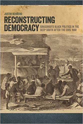
Professor Behrend, a history professor at SUNY Geneseo, focuses his research on black politicians during this time period, specifically in the Natchez region. This region—named for the city of Natchez—comprises six main counties straddling Mississippi and Louisiana. Behrend’s book, Reconstructing Democracy: Grassroots Black Politics in the Deep South After the Civil War, argues that the amount and range of offices held by black politicians during this relatively short period of time (roughly 30 years, from the late 1860s to the 1890s) represents a grassroots democracy movement by black communities in opposition to the white power structures surrounding them.
Data collected by Behrend about the African-American politicians during the post-Civil War Natchez region covers both information about the offices they held as well as personal information such as other occupations, literacy status, county affiliation, and many other categories. Professor Behrend stored this information in a spreadsheet which he published to the web a few years ago. Through this digital humanities project, Professor Behrend and I wanted to create a new and more interactive place to store this data. Based on that goal, I knew I wanted to create a map of the politicians.
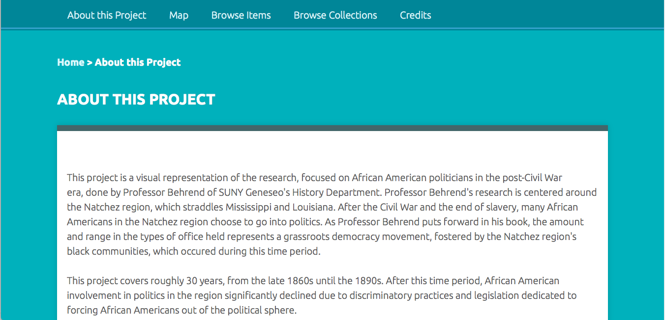
My project website, hosted by Omeka, opens with a short “About” page to give any visitors context about the origins and purpose of the project. Visitors can then click on the “map” tab to take them to the map I created using Neatline. Visitors can also click on either the “Browse Items” tab or the “Browse Collections” tab to peruse the data by individual person. I also have a tab labelled “Credits” where I give credit to and thank those who have helped me along the way with this project, namely Professors Behrend and Schacht, Dr. Kirk Anne, and Wayne Graham on GitHub (whose Neatline base map I used as the background for this project).
Homepage for my Omeka website.
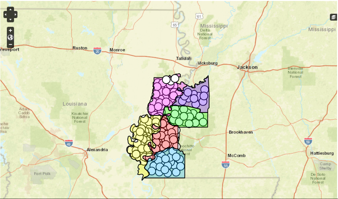
I decided to use Omeka and specifically the plugin Neatline to create the map. I decided on this because I knew that Neatline could create a map with multiple elements, including layers for the multiple counties and a pop-up box with information about the person when you click on their point on the map. Using a map to visualize data (especially connecting people and places) is an idea seen very often in traditional humanities. Seeing data, rather than simply reading about it, is a well-known method of increasing one’s understanding of the data and the overall argument. This project in particular uses a map to emphasize Professor Behrend’s argument about black communities creating a grassroots democracy through becoming elected officials in their region. When one first clicks on the map, it is obvious by the amount of points on the map that African-American political activity was significantly high during this relatively short time period. Beyond the traditional humanities, hosting a map on an Omeka site through Neatline—instead of creating a physical map—adds another useful element because you can include significantly more information. A digital map created with these programs allows an interested party to not only visualize the concepts but read more about each individual person represented in the data. A physical map does not have the ability to load up a sidebar of information when one clicks on a data point. The power to do this, particularly in a case like this project where you have many data points (roughly 400), makes the digital map even more useful than a physical one.
Map, created with Neatline, of black politicians in the Natchez region. Each colored shape represents one of the six main counties of the region and each dot represents an individual politician.
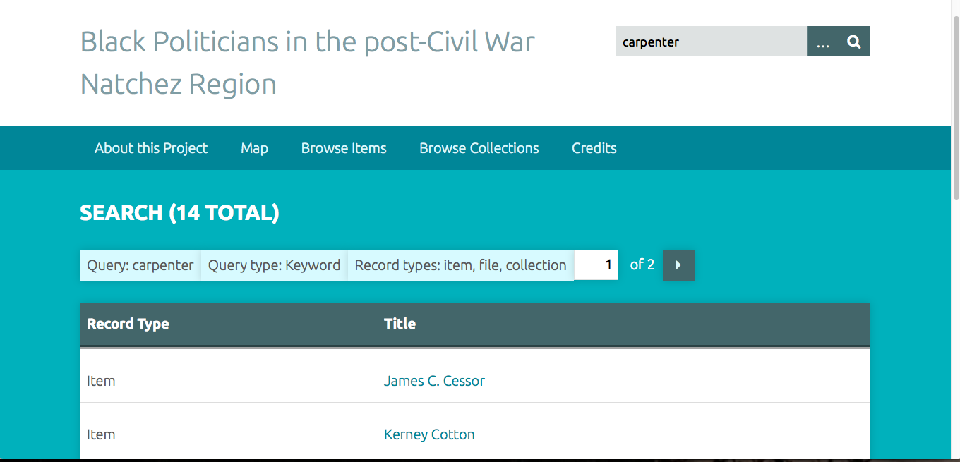
Another advantage of using Omeka was how well the archiving portion of the software suited the spreadsheet origins of this project. While archives are created and used all the time by traditional humanities projects, having an online archive run by Omeka offers additional features that a physical archive does not. The first advantage is the enlarged audience a digital archive can reach. Being able to access the archive using the Internet (not having to travel to a physical place) opens the door for more people to find and use the data. A digital map may also attract a larger audience since it is a quicker and easier way of demonstrating a main concept than reading the book. The other significant advantage of a digital archive is the interactive portion that Omeka offers. When I started this project, I did not anticipate that the Omeka archive would be searchable. However, now at the conclusion of this project, I realize that being able to search all items for specific terms is incredibly handy. For instance, if someone is searching the database for a specific person but only knows their occupation (say carpenter) and their birthdate (say 1837) then they could search the database for “carpenter” and cross-reference the results for people born in 1837 to find their person. The searchable aspect of this digital archive is also useful for anyone utilizing the data to find patterns for their own projects.
Example demonstrating what searching for “carpenter” among the Omeka items yields.
While creating this project I encountered a few challenges working with Omeka and particularly Neatline. The first problem I encountered was getting Neatline to work on my computer at all. Professor Schacht helped me solve this problem as he posted on a help forum and figured out that a typo in the Neatline file folder was preventing functional use of the program. A problem I ran into while creating the map was uploading files which had outlines of the county maps. I had found a website which specialized in historic county maps and had them available for download as either ArcGIS or KML files. Originally I thought I would be able to turn the KML files (KML being a type of XML) into SVG files, which are importable to Neatline. However, I could not find a KML to SVG converter that had the ability to convert the files. To overcome this problem I utilized Neatline’s “Draw a Polygon” tool and traced the county borders myself.
Overall, I learned how to work with online exhibits, data collections, and digital maps. At the beginning, while I was figuring out which program to use, I played around with Google MyMaps and TimelineJS so I learned the basics of those programs as well. Learning how to use Omeka is particularly relevant to me since I am currently applying to graduate school for archive management. Omeka is often used by archivists to create online collections so learning how to use the program and gaining hands-on experience with it will most likely be useful for me in the future. Engaging with questions of how to create a digital archive and map—both in the technical sense of how to use the programs and in the more abstract sense of what information to include, how to space the data points, and what each design decision means for the interpretation of the data—has given me a solid introductory grasp on what the digital humanities are and how they can be applied.
While my project did not necessarily reach any new conclusions about this data, I think it did reinforce Professor Behrend’s thesis in a new way. Being able to see how many African American politicians existed in this region (roughly 400) over a fairly short period of 30 years underscores the political and social agency which black communities created for themselves. This period of black political activity is often not covered in American history classes so it is important to acknowledge its existence. Using Omeka and Neatline offered a way to both create an interactive digital archive—an evolution of Behrend’s original spreadsheet—as well as convey this thesis through a visual component.
19th century American women writers received plenty of disapproval and even derision for their work during their lifetimes, and their texts were often placed into boxes – domesticity, sentimentality – that may not be fair representations of what they were really interested in writing about. Take Nathaniel Hawthorne’s biting remark about his female contemporaries as an encapsulation of this attitude:
“America is now wholly given over to a damned mob of scribbling women, and I should have no chance of success while the public taste is occupied with their trash-and should be ashamed of myself if I did succeed.”
With this in mind, I aimed to perform a textual analysis in two parts: on an individual author basis, with five selected writers I have studied in the past year, and on a macro level, with a larger sample of women’s writing from this period being gathered together for a much more distant read. My intention was to identify patterns throughout these texts that, for the individual authors, indicate the weighty social issues being address (slavery, education, law, and economic empowerment are big ones), and for the macro-level analysis, show us how sentimental their writing may be.
Analyzing the language of texts is a very traditional humanities aim; essentially, I’m performing the age-old task of drawing connections between a piece of literature and its historical and social contexts, as well as challenging preconceptions about who we read and why. Where this project really differs from traditional scholarly efforts to read and understand texts is in the way it analyzes literature. Instead of performing a close reading, I’m using digital tools to “distantly” read literature – pulling out patterns and data that may suggest what writers are focused on without necessarily having a strong, intimate understanding of the individual text. This reading also allows humanists to evaluate an entire subset of writing – the nineteenth century, women, etc. – and find intriguing results to further evaluate, rather than build an understanding from the ground up by developing an expertise in specific works of literature.
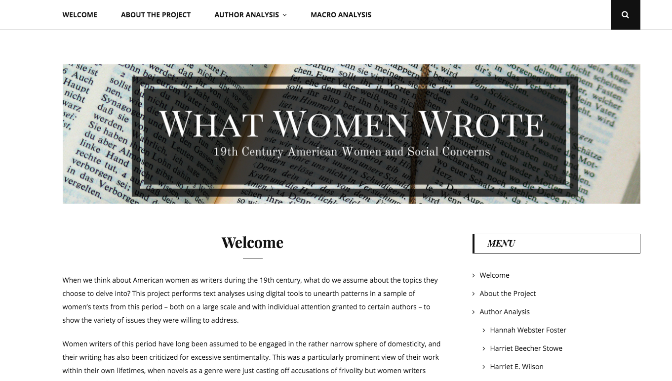
This work was all compiled on a WordPress site, which went through a few different themes before I settled on one that would provide the easiest navigation for visitors – a side menu bar with the various options listed in full as readers are scrolling down each page, paired with a top menu that also shows where these pages can be found at a glimpse. I was also aware that I didn’t have too many eye-grabbing images to include, so I needed a more text-centric theme that was still appealing to visitors.
The first page users will come across is the welcome page, which introduces the project, addresses its impact, and briefly points to some of the conclusions that can be found in the analysis pages of the site. I’ve also incorporated an overview of the texts being individually analyzed in a Timeline JS timeline, which can be seen below:
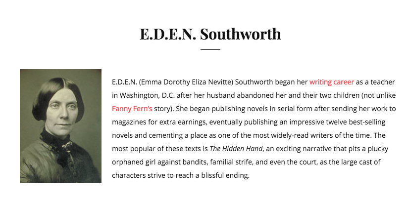
My intention is that users will first, if interested, look through the author analysis pages in order to learn more about each of the women’s writings I selected. On each page, I include a brief introduction of the writer, and then the text analysis put in context with my own close reading of the novels or other pieces being examined. For the analysis, I used Voyant Tools, a free online resource that allows users to upload text files and analyze them in a variety of ways – for my purposes, I mainly used Word Cloud, which is a visual representation of word frequencies, and Trends, which creates a graph tracking the relative frequency of specified words across one or multiple texts.
The introductory text for E.D.E.N. Southworth.
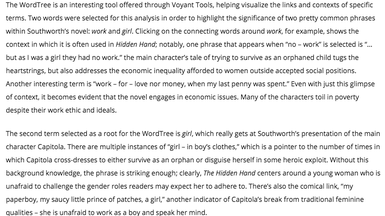
The best way I found to represent these results was to embed them directly from Voyant Tools, which allows users to interact with the graphs rather than just view them as an image. This has the potential to create issues with my project – it’s unclear how permanent these embeds are, since they’re hosted by Voyant Tools itself. So far, it’s been a couple of months and there have been no complications from this, but I did save the graphs as PNG images just in case I need to insert those instead. The benefits of the embedding can best be seen in the Word Tree chart I used for E.D.E.N. Southworth’s The Hidden Hand – with this tool, users can click on selected words to see their linkages and contexts. Try it for yourself below, and explore Southworth’s usages of the terms girl and work.
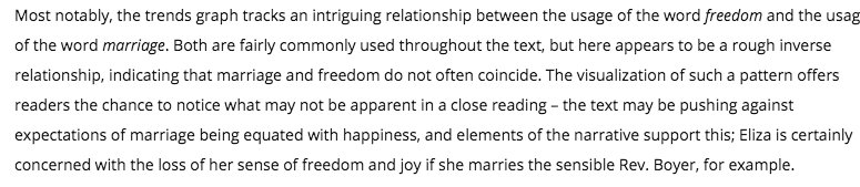
As a whole, I found some really interesting patterns using Voyant Tools on the smaller-scale level. Although I cannot include all the author analysis pages on this post, Hannah Webster Foster’s Trends chart is another example of the conclusions that may be drawn using digital tools.
Here, I’ve embedded the Trends chart from this page. Although readers can see what they find on their own by clicking through it, I’ve also included my own analysis:
The visualization of the pattern discussed above offers readers the chance to notice what may not be apparent in a close reading, or understand how Foster might be pushing against social norms even if they haven’t had the opportunity to read her novel The Coquette for themselves.
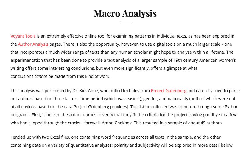
The second part of my project is the macro analysis, and the best description of how this was developed can be found right in its page on the WordPress site:
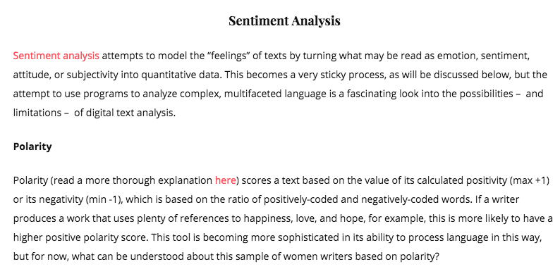
Sentiment analysis became a major focus for this part of the project – using digital tools to evaluate the emotions, positivity, subjectivity, and other non-quantitative aspects of a piece of writing. Polarity is one of the key aspects of sentiment analysis, and what I’ll be using here to demonstrate some of the difficulty I’ve had in drawing conclusions from such a tricky tool. For a description of sentiment analysis and some of its issues, read another excerpt from the project:
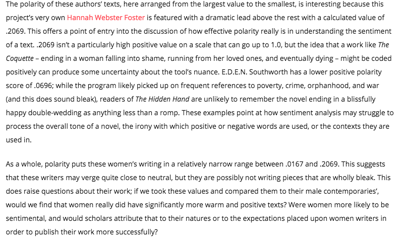
Here, I’ve embedded the line chart that has been produced from Kirk’s data on the polarity of these nineteenth-century American women writers, and also shared my interpretation of it below. As noted, a higher positive value indicates a more positive use of language (closer to +!), while -1 represents max negativity.
Text analysis was a much more conceptually simple tool when I was using it to evaluate individual texts that I was already quite familiar with, and I think the context I lend the graphs in my individual author pages help readers draw significant conclusions – yes, women writers in this time were interested in some pretty major and controversial national debates. Harriet Beecher Stowe, for example, wrote one of the most influential abolitionist works in our nation’s history, but my site also lets these results be read alongside the less well-known Harriet E. Wilson’s examination of the same issue in a much different context:
The macro analysis is inherently more problematic, but I end my project with the conclusion that sentiment analysis can offer humanists potential directions to take future work. I can’t make decisive conclusions just from the polarity and subjectivity results in the scope of my project, but they would have much more meaning if compared with the same values from a sample of men’s writing, or even from a sample of twentieth-century women writers. There are so many directions to take this kind of work, and I think my project succeeds in at least addressing this possibility. This has been a conceptually challenging undertaking, but over the course of the semester, I’ve been able to not only increase my technical skills (building a WordPress, performing some basic text analysis, doing plenty of embedding) but also my theoretical understanding of how humanists can use digital tools and technical, quantitative analysis to draw conclusions about literature.
The end of my welcome page, addressing these same issues.
Finally, my pièce de résistance for Digital Humanities is complete. This project’s main goal is to show the connections between the precedents set in Cold War influenced reality and how they compare to the fictional life of James Bond – Britain’s most powerful propaganda film series amidst rising tensions during the Cold War. By doing so, I establish the connections that show the way in which the U.S. and Britain had each other’s backs during one of the most anxiety-inducing times in global history.
My project sets out to accomplish traditional humanities work by explaining the allied relationships between the U.S. and Britain during the height of the Cold War. It’s important to show this relationship because of the severity of crisis at the time. The James Bond films, while brilliant popcorn movies, served a large role in defining British and American nationalism during a period where morale was down and peoples’ level of fear was up.The idea of nuclear annihilation, as well as devastation resulting from the Soviet Union’s nuclear stockade, was present in the minds of the British and Americans alike. With the help of these movies, people took solace in knowing that James Bond, who is a representation of British nationalism as well as American hardheadedness, would ultimately end up taking out the enemy – Britain always wins in the end, he has never failed to complete his mission.
By using the arcGIS Map Journal platform, my project goes above and beyond the ways traditional humanities work could have portrayed these connections. The interface of the online program makes it easy to navigate the five sections that I have created.
Above is the homepage that the viewer first sees when they click on the project. On the left is an introduction of the project, as well as what its main goal is. On the right is the map section of the website. Here you can see several locations on the map, all of which are color-coded and correspond to their respective movies.
As you scroll down through the webpage, information about the movies appears on the left. For all of my sections, the first paragraph explains, briefly, the plot of the movie in order to help the viewer understand the relationships better. Following the summary of the film is where the meat of the project is – the information that draws parallels between the films and reality. Also as the viewer scrolls down, the map limits its focus on the points where the the setting is explained. Every point on the map is specific to each movie, but they all serve the same purpose of explaining why the setting of the film is important. This serves the purpose to help solidify the ‘bonds’ between reality and fiction in each film.
As well as key metadata and textual information on the left-hand side, I also decided to implement video clips from each movie. Luckily, all of my arguments were supported by the clips previously uploaded to YouTube, meaning I didn’t have to purchase all five movies and rip clips from the original film. This not only saved me time (and money), but it also puts the reader in the movie. By adding clips, the viewer can see, first-hand, the dynamics between the Bond and/or the villains in each section of the respective films.
I did not have many problems with my project, for it was all pretty straight-forward; however, there were a few tool errors that impeded on how quickly I was able to compile my data. For example, the image below shows the administration screen that allows me to edit the data placed in the pointed spots on the map. Whenever I tried to save the the data, it would, however it would not update on the original screen. The solution to this, while easy enough, proved to be quite time consuming. Every time I was to save my data, I had to refresh the admin page, save the data on the main screen, and only then could I actually save the textual information on the administration page.
This project taught me a large amount of information about the importance of using digital tools to expand on social problems. Earlier in the semester, I looked at a site called, “The Story of the Stuff,” which is a website dedicated to promoting the importance of human kindness by providing information on the amount of hand-written cards and other sentiments that were sent to Sandy Hook Elementary. At the time, I didn’t understand why the use of a digital platform served such a large purpose, but in my own project, I now understand that by digitalizing the humanities, the level of understanding through the viewer becomes more thorough wile remaining easy to understand. I enjoyed my time in class this semester, and I will be sure to use the digital tools I learned in the class in the future.
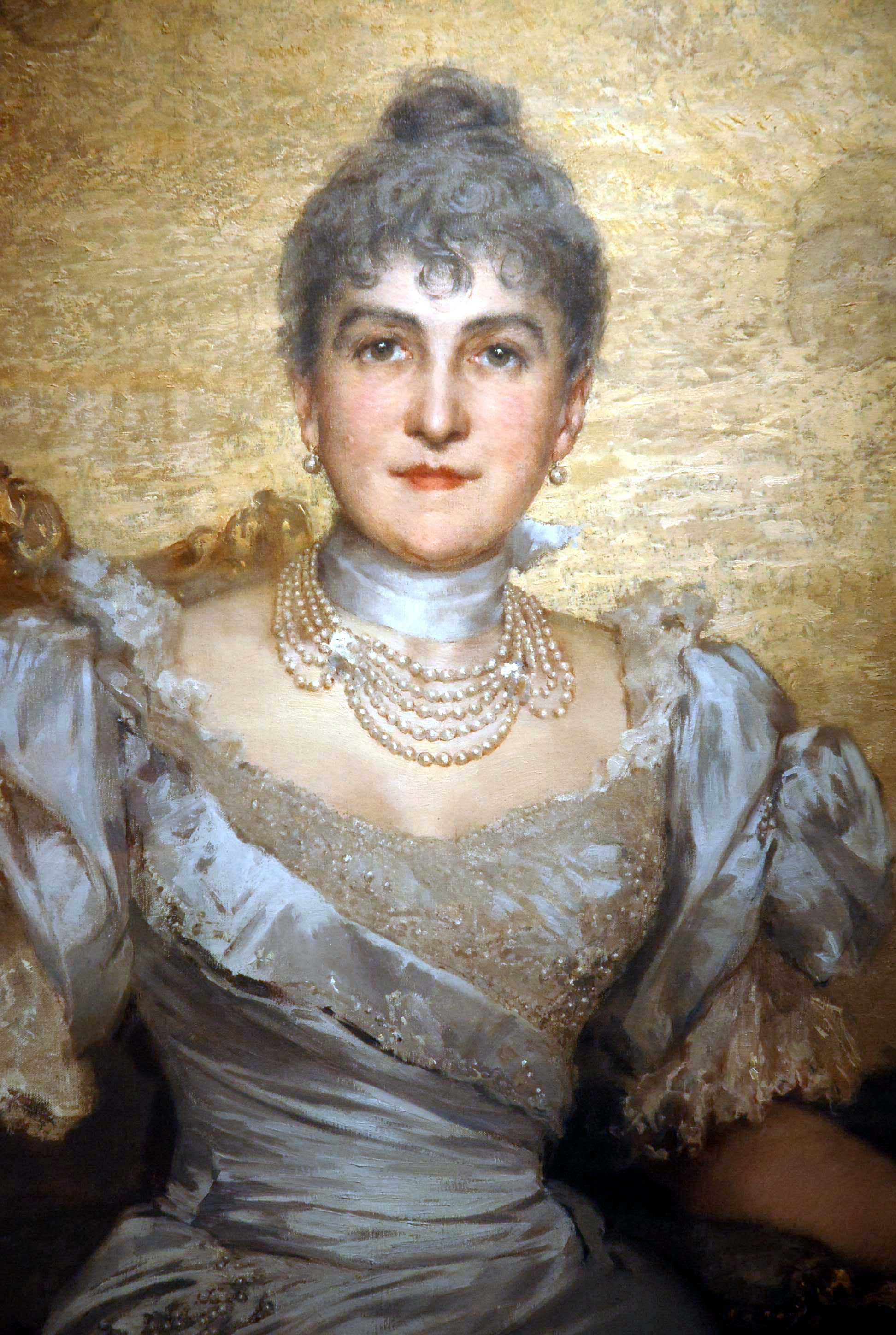
My project aims to create a digital biography/storymap of Cornelia Wadsworth Ritchie Adair (1837-1921), a pioneer originally from Geneseo, New York who played a substantial role in land development in Donegal, Ireland, and Southwest Texas. After her marriage to notorious Irish landowner John George Adair, Cornelia managed their estate at Glenveagh and was the primary manager of the JA Ranch in Texas, which at its height consisted of 500,000 acres primarily used for cattle grazing. Following the 1916 Easter Rising, Cornelia fled Glenveagh and devoted her time to land expansion in Texas.
Considerable primary and secondary source material exists on Cornelia Adair because her life intersected with many developing narratives of the late 19th century–including Irish land wars, the Easter Rising, Native American land relations, early environmentalist practices and Republican philanthropy. However, I wanted to organize and compile these sources into one website that focuses a narrative on Cornelia Adair, with a particular focus on the way Adair transformed spaces with an eye towards community development. As such, I decided to organize available primary documents and existing research on the Adairs into a biographical story map, which provides a spatial lens for assessing Cornelia Adair’s extensive travels and proto-environmentalist land practices.
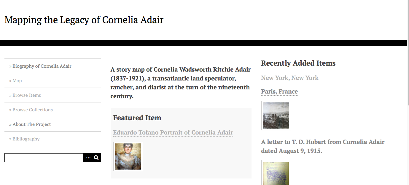
the homepage of my website
Before beginning the digital map, though, I had to develop a homepage and subsequent pages that would contextualize Adair and provide users with a fuller description of her biographical legacy. I used Omeka, an open-source digital archivist platform, to create “items” related to Adair, most of which contained a picture, source/publishing rights information, and several sentences of description to explain how that particular item connects to Adair’s larger narrative story. I also added three simple pages to the navigator of my site: a biography page, in which I provided a short (~750 word) biography of Adair; a bibliography to aggregate my sources and provide users with further reading material; and an “about the project page.” In this last page, I state the goals of my website, its origins in my research grant from the Geneseo Foundation, the digital platforms I used to make the site, and an acknowledgement to the folks who helped me in my research (including Dr. Schacht, Dr. Anne, Warren Stricker, and Sean O’Gaoithin). I also organized my items into collections, so users can quickly browse collections such as “pictures of Cornelia Adair” or “letters from Cornelia Adair” without combing through the map.
the navigation bar of my website
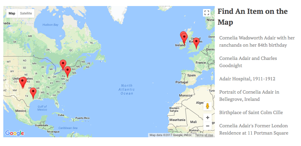
Finally, after adding the appropriate biographical and contextual information onto the site, I began developing my original aim for the project: a digital storymap. I used the Omeka plugin Geolocation to locate each of my items to a specific point on a map. From there, I was able to create a more holistic, spatial representation of the scope of Cornelia Adair’s travel and activities. Users can browse the map to find items, or zoom in to read about the legacy of Cornelia Adair at a particular place.
Map of Cornelia Adair’s Legacy
This is just one example of many forms of storymaps (I wrote about an earlier one that examines Yeats’s legacy created by the National Library of Ireland), but in general, I feel that my project helps build onto Cornelia Adair’s biography by showing how her activity connects to particular spaces. For visual and spatial learners, maps are often a critical way to transmit stories, which is what I sought out to accomplish in this project. However, the “about” section and “browse items/collections” feature of my website allows users who learn textually to explore the same content outside the confines of a map.
There are still many directions for me to expand upon my website on Cornelia Adair. For one thing, I’d like to incorporate photographs I’ve seen of Ireland’s land surveys of Glenveagh castle from before and after Cornelia’s time there, because these maps illuminate how Cornelia built and transformed a physical place, one that now operates as a national park in Donegal. I also want to add an audio recording of an interview I conducted with Sean O’Gaoithin, the head gardener of Glenveagh National Park (Sean has researched Cornelia’s influence extensively). For now, though, I’m happy with the outcome of my project, and satisfied with the ways Omeka and Geolocation enabled me to visually tell a story that compiles a wide range of resources from various locations. The tool (or really, set of tools) is an excellent platform to expand upon the traditional practice of archiving and categorizing historical information to convey broader narratives.
With this project, I sought to compare the spread of district schools in Perinton to that of the centralized schools in Fairport, New York. Construction of the Erie Canal was completed in 1825 in New York state. The man made waterway runs through Perinton. The completion of this canal led to surging population increases in Perinton and the need to develop a school system.
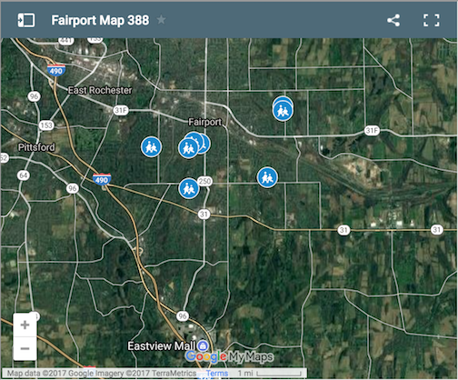
I utilized the digital program Google MyMaps to expand my project. Google MyMaps is an expansion of Google Maps which allows users to expand on face value information provided in the maps, and implement their own metadata. Users can select an established point or location, or add a new point to the map. After adding a point, it is possible to add pictures and descriptions. Symbols are important to maps, and they can represent what stands at a location. MyMaps provides dozens of icons with hundreds of color combinations to clarify what different types of structures and land are present at different locations.
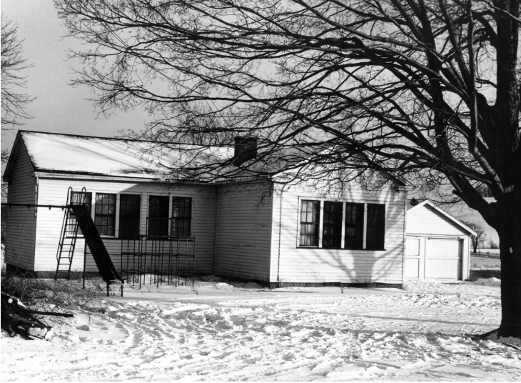
I plotted locations of the eleven Perinton district schools used in the 19th and 20th centuries, and added metadata to these points. Pictures of some of these buildings were available to me so I implemented these visuals. Additionally, I wrote brief captions and explanations of these schools. This layer is entitled “Old Schools”. The separate layer of the map I filled is the “Current Schools” layer. Users can select and deselect the layers to view and compare locations of the school buildings that have been utilized within the town over the years.
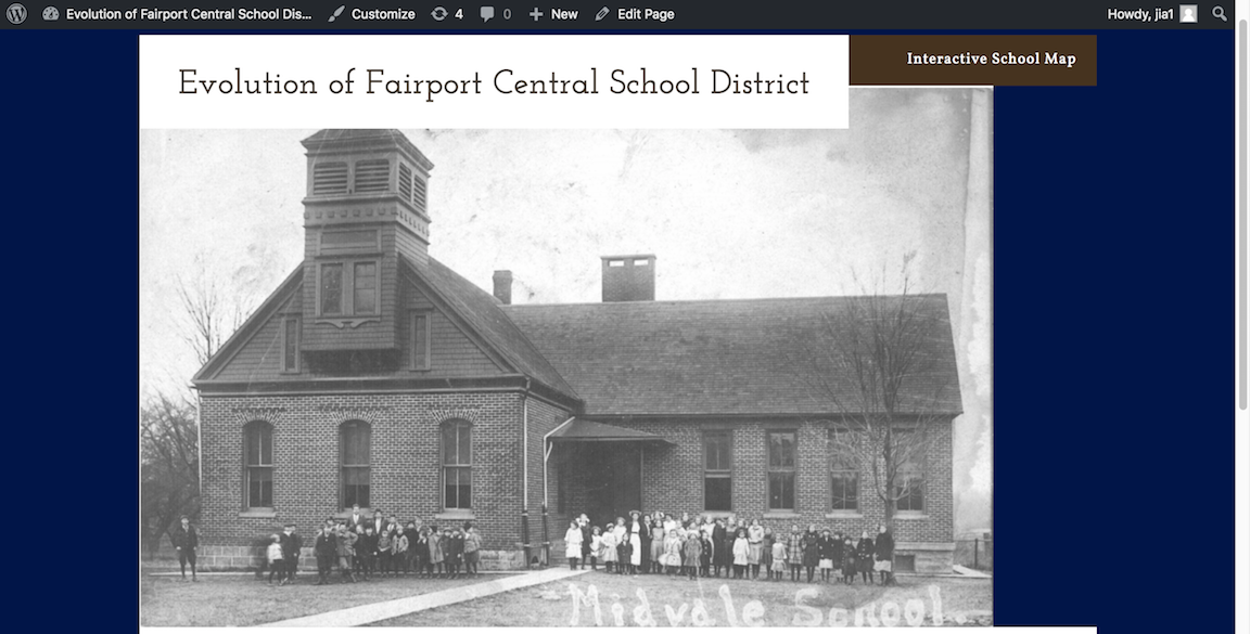
I hosted my project through a WordPress installation I worked on in English 388. Using the “Hotel” theme, I wanted to make my website accessible and easy to navigate. The “Interactive School Map” post on my WordPress contains the MyMap project as well as a detailed explanation of the information contained. I wanted to make sure my website is accessible to anybody, and user friendly.
I think it is important to preserve history digitally. Where traditional humanities practices in history may fail to protect documents and ensure that they are accessible, a digital host for information is within reach for a much larger audience. Additionally, the ability for an audience to interact with a project and draw their own conclusions objectively is quite important in its own right.
I enjoyed my time and work invested into this project and my overall studies in “Digital Methods for Humanists” with Dr. Schacht. Though I am a novice when it comes to technology, this course has broadened my skill set and showed me ways that digital tools can support studies and work in the Humanities field.
Historical Homestead is an examination of the Wadsworth Homestead and its connection to larger historical contexts through the use of virtual reality technology.
Homepage:
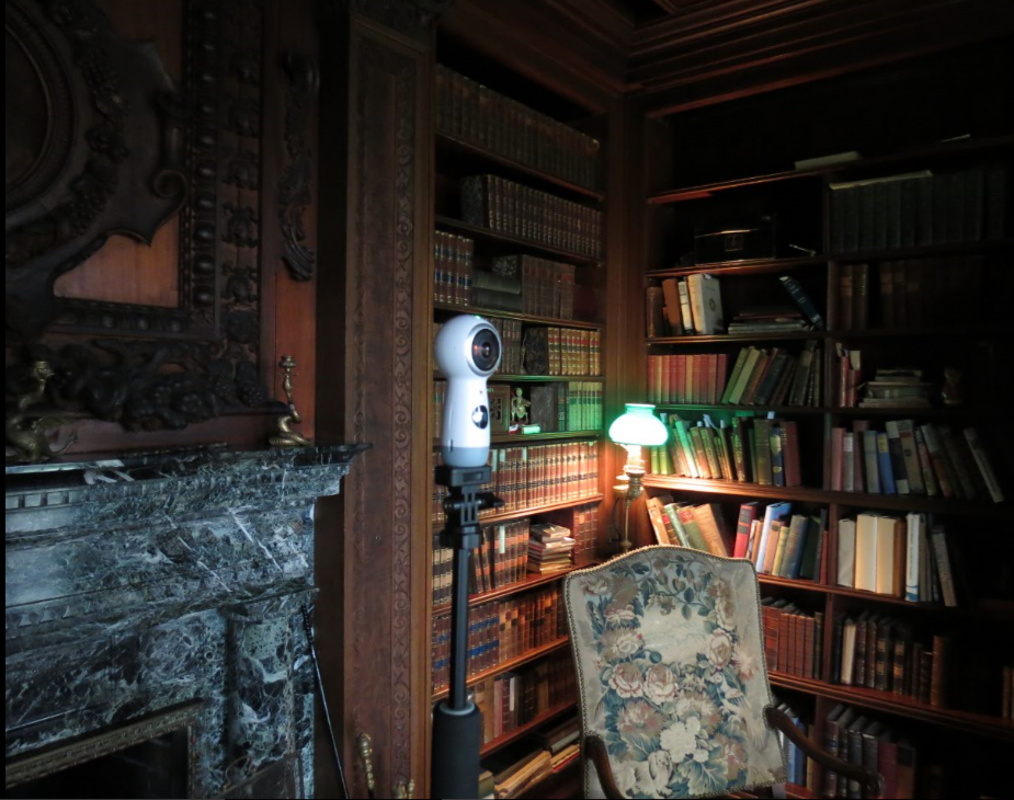
The Samsung 360 camera is use at the Wadsworth Homestead’s Library
The opening page of the site presents a clear, organized format of pictures and text. The first thing one notices when visiting the site is the large circular pictures at the top. This was the original format the virtual reality “photos” came in, direct from the 360° camera’s two curved lenses. I thought this was both a beautiful picture of the inside of the Homestead, as well as a subtle introduction into the virtual reality (VR) process.
In the middle of the page, there is a block of text to provide context about the house and the Wadsworths to the viewer. This was taken from my essay on the house for my Museum Studies class. It introduces briefly the contents of the Homestead and why it is significant. The ending paragraph is the thesis of the entire site, written below:
Through virtual representations of the objects and rooms of the Wadsworth
Homestead, Historical Homestead aims to illustrate a larger connection between
the Wadsworth family and Geneseo, American, and global history.
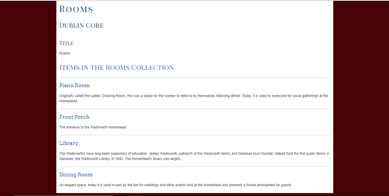
The navigation bar at the top of the homepage was customized for this site. I felt the Omeka terms “collection” and “item” were confusing to use for this project. The items I cataloged for this project were in two groups, “Rooms” (such as the library and the dining room) and “Object” (such as a portrait on the wall of the dining room or a book on the shelf in the library). However, objects and rooms were both technically classified as “items” in Omeka. I thought this would create confusion, since the objects were stored physically in rooms and “item” seems like an odd term for a room. To avoid this issue, I redirected the “Browse Items” and “Browse Objects” tabs towards a “Rooms” page and an “Objects” page, and renamed them accordingly, as you can see below.
The navigation bar for Historical Homestead, located at the top of each page.
This reclassification on the homepage I feel solves the confusion of labeling and provides easier navigation throughout the site.
Virtual Tour:
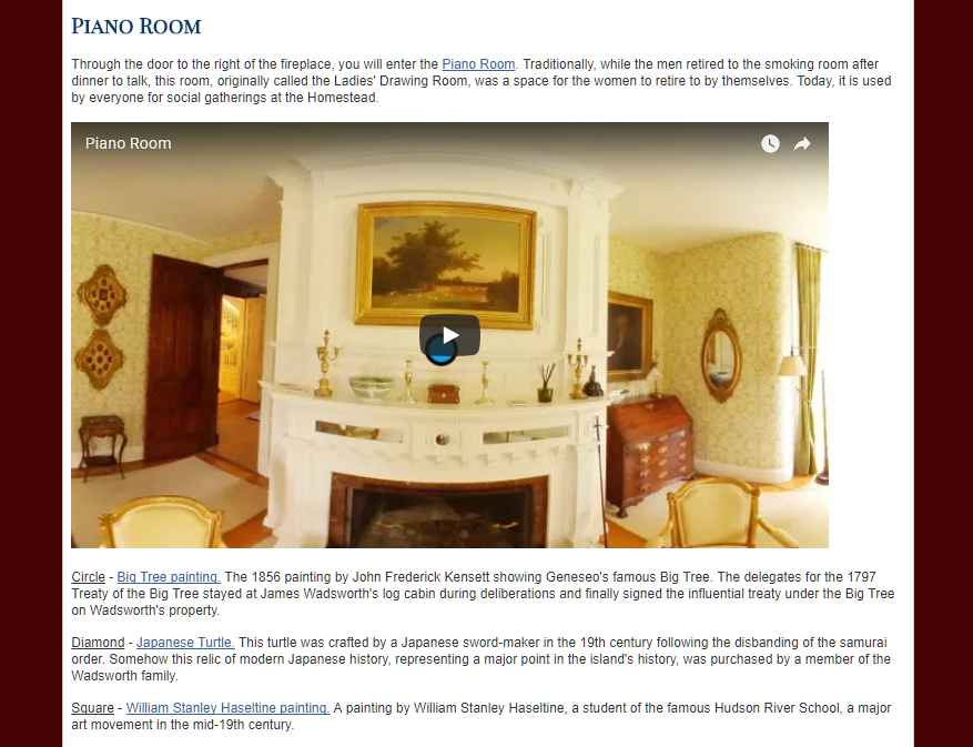
The Piano Room section of the Virtual Tour.
The second link on the navigation bar, “Virtual Tour,” is the heart and soul of the entire project. This is where the aim of the project, illustrating a connection between the Homestead and larger historical events, is presented. As a visitor scrolls down the page, they are taken through a virtual tour of a selection of rooms from the Homestead. The rooms were specifically chosen for their ability to illustrate larger contexts of history.The layout of each section consists of an introduction to the specific room, the VR video-frame, followed by a list of the objects cataloged from that room. Each object is accompanied by a brief description of their significance.
The VR video-frames are the most interesting part of the page. Hosted on YouTube, viewers can interact with the video and move the camera up, down, left, and right, as if they were looking around the actual room. Since they are hosted on YouTube, the video time will eventually run out. This is why I made them each one hour long, giving viewers plenty of time to explore without having to restart the video multiple times. The Piano Room’s VR is presented below as an example:
The blue shapes placed around the room are to highlight specific objects. I originally wanted clickable links embedded on the objects, instead of the shapes. Given the time frame of the project and our overall technological understanding, such a feature was out of the realm of possibility. Placing the shapes near the object instead, and using them to reference information below was the solution I felt was best. Each object’s description is accompanied with the link to its unique catalog page, where viewers can read more information about the piece. The brief description given on the Virtual Reality page is to illustrate the larger context in history between this object and the Wadsworths.
Overall, the Virtual Reality page came out wonderfully. There is an easy flow for users, as they scroll down through the rooms, or click to exterior links for more information. By the end of the tour, the reader will understand the larger connections between the Wadsworths and history.
Rooms and Objects:
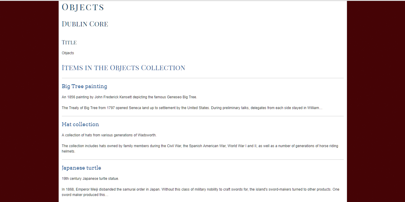
Rooms section, listing the individual room pages.Objects section, listing the individual object pages.
The final sections of the website present a grouping of all the rooms and a separate grouping of all the objects. These pages serve as catalogs for the items, where viewers can click and read more information about a specific room or object on their specific page. Each room or object page is linked to in the Virtual Tour, but these separate pages listing the items allow for quicker access to more information about the specific item, without the hassle of searching through the Virtual Tour.
Overall:
Historical Homestead, through its simple VR program and site layout, conveys to readers my thesis in an easy to navigate digital world. This is how the project captures elements from both traditional humanities work and digital humanities. Presenting a thesis and supporting that claim through evidence is what traditional historians do. My presentation of the rooms and objects in a virtual environment, while utilizing exterior source links, is the newer digital aspect of humanities work. I think we reached the goal of presenting the Homestead in a thorough manner and illustrating the family’s connection to larger historical events from the foundation of the Genesee Valley Hunt to imperial Japan. This is a much better result than the initial project of simply a VR tour of the Homestead. Using the VR to illustrate the deeper history of the Wadsworth Homestead produced a much better and more engaging project.