What Made the Dead so Grate?

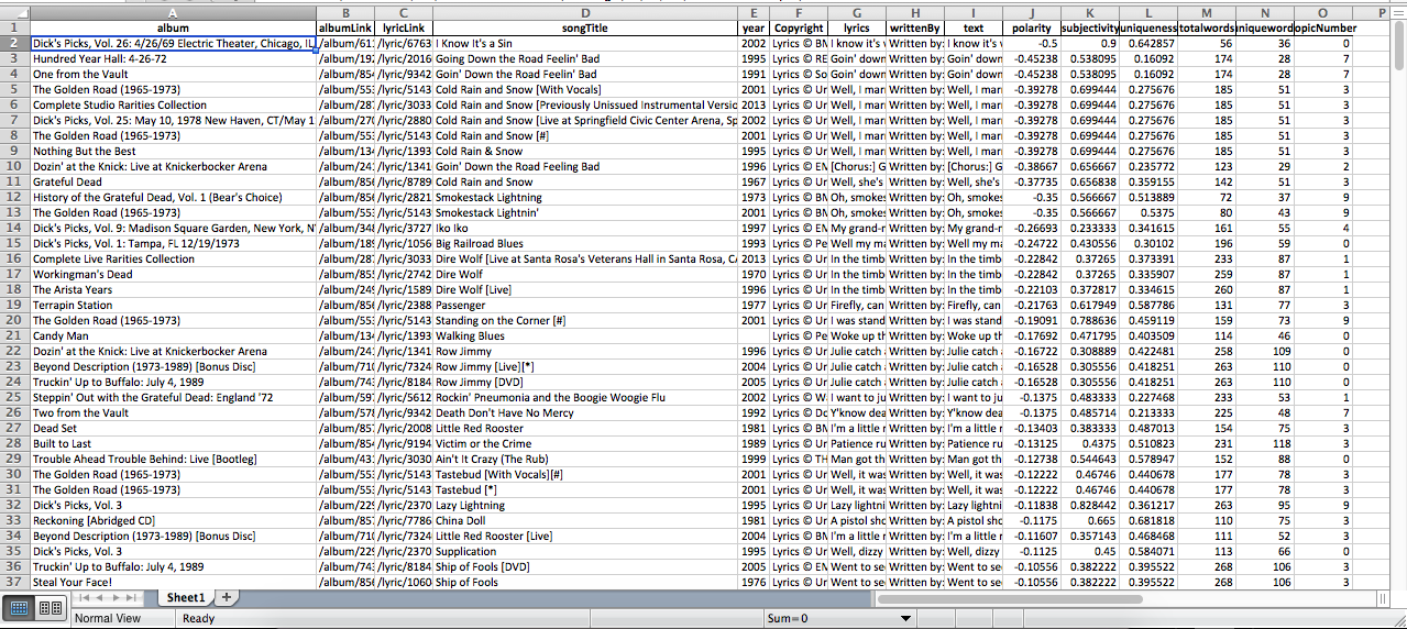
My digital project serves two purposes surrounding the Grateful Dead. My first purpose is to illustrate where each Grateful Dead member got their influences. I also looked at the polarity of their songs. Since I am a long time Dead fan I had a lot of knowledge about them already, but I did not know very much about who or what drove them to create psychedelic rock. My research consisted of documentaries, interviews, the book “Deal” by Bill Kreutzmann, and online research to solidify the facts I already knew about each member. This project was completely different to what I was used to doing. When Professor Schacht introduced the idea, I was very scared up until the middle of October because I knew very well that I am not good with technology and understanding the use of computers. Throughout the course I learned a lot, we learned some coding, how to make a website, how to use Timeline JS (which I used in my project), how to embed youtube clips, pictures, or anything really. For my project I choose to use Wordpress, the reason was because it looked like it would be easy to master and I did do a good job learning the ins and outs of the site. For my timeline I inserted every song that I selected to look into for the polarity of them. The first ten songs listed on my site are the songs that I believed were either happy or dark. Then the last six songs listed on my site are the songs that the software thought were the darkest or happiest. For the polarity section of my project Kirk Anne helped me a lot. He used a software called “Textblob”, the software computes all the words in each song to determine whether or not the song is dark or happy, Textblob and I had a couple of agreements and some disagreements.

Spreadsheet of song polarity: Made by Kirk Anne


The first challenge I faced was creating a website. I didn’t even start a website until the end of October because I didn’t know how to use it too well and I thought I would ruin the site altogether if I tried to get started. While I was still trying to get over my fear of technology, I did the research and wrote down all the content for my site using google docs. I overcame my fear by going to office hours with Kirk and Professor Schacht so they could help me better understand how to work Wordpress and to do better in the course. I still have a one challenge left in my project; I wanted to cut out scenes from the Grateful Dead documentary on Amazon, but due to copyright issues I was never able to get this on my site. How did I overcome this obstacle? I noted down where I wanted to cut the scenes while watching the documentary so I could remember where I should go. Thankfully I did this because I decided to quote the scenes that I wanted to cut out. Although, it is not the way I wanted it to turn out because quotes are not nearly as good as someone from the band speaking about their experiences, I was still able to make it work.   

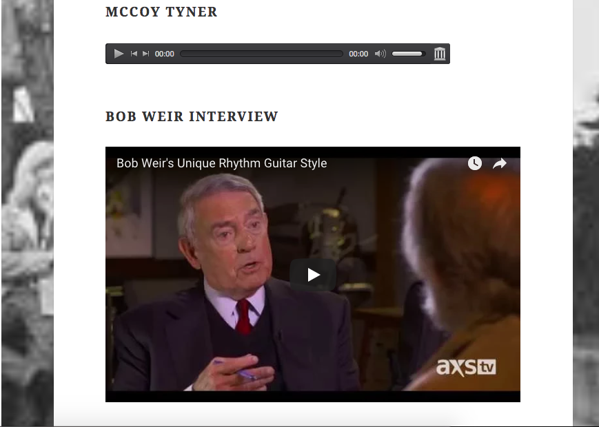
Screenshot from my site, the top bar is embedded from Archive.org and the bottom from YouTube.


My website is easy to navigate because I wanted to keep as simple as possible, but at the same time make fun and exciting for anyone who visits the site, not just Deadheads or people who enjoy reading about music.

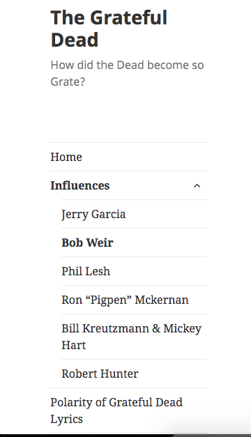
Screenshot of the sidebar on my site

This is the only sidebar I have on my site, I choose to only do one because again, it kept the project simple and concrete. When you click on the arrow next to “influences” all the names of the band members get hidden. I like this aspect because it makes my site look clean and organized.

Throughout the semester I learned a lot and I am extremely happy that I took this course. All the digital tools that I have learned how to use this semester will be very useful in the future, whether it is for a school project or for a future job. Thank you Professor Schacht and Kirk for a wonderful semester!  

The Ecological Benefits of Good Advertising

This project is live at https://jacksnyderdh.wordpress.com/

The purpose of this project is to show how the Metropolitan Transit Authority (MTA) builds a community between a company and its consumers through carefully crafted advertisements in a way that benefits both the MTA and the riders. I analyze details ranging from the implications of personal pronouns to feelings brought about by background art, all of which work together to make riders feel like part of a community and more environmentally aware of their actions; this in turn promotes riders’ continued use of the subways and reduction of their ecological footprints at the same time. This analysis is worthwhile to both consumers and companies alike, as consumers can become more consciously aware of the impacts felt from different styles of advertisements, and companies can be prompted to change their style of advertising from a toxic consumeristic cash-grab to a more positive and mutually beneficial model.

This is essentially the traditional humanities aspect of my project. Examining how a corporation can use advertisements to influence its customers is useful to corporations and consumers alike, and shows how interactions between different groups of people can be mutually beneficial. My project reinforces the importance of community in maintaining healthy and ecologically efficient lives, which benefits everyone involved if practiced truthfully. As a traditional humanities project would, I break down and compare elements from various works in order to convey a pattern in messaging that the MTA uses to the mutual benefit of the company and its riders.

However, there are many elements of my project that distinguish it from a traditional humanities project. Along with a photo of each advertisement, I made smaller edited versions of their elements that I discuss, and integrated them in the text. This allows users to directly compare my analysis to the related elements without having to move back and forth around the page and search for each specific element in the photo, all while potentially forgetting what the analysis was or losing their place in the text.
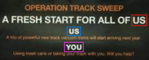
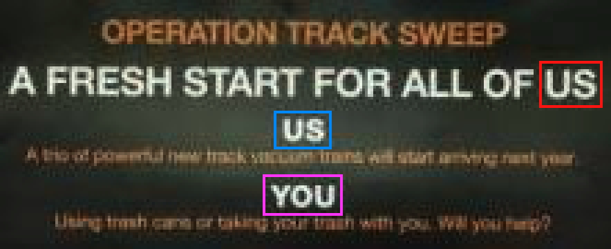
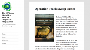
For example, the photo to the left is from the Operation Track Sweep poster. I color coordinated words in the photo with their reference in the text to make the context less confusing (e.g. when discussing us or us) and to make it easier for users to identify which elements of the advertisement are being discussed.

Each advertisement being in its own blog post allows for a certain level of interactivity between the users and the content, where users can comment on each advertisement’s blog post or share the posts to social media.

I have embedded YouTube videos within a couple of my posts and analyze the contents of the videos as they relate to the advertisements. For example, I have the Operation Track Sweep poster and its analysis, as well as a YouTube video that is by the MTA and about the Operation Track Sweep initiative. I draw parallels between personal pronoun use in the poster and in the video, which establish a community between the MTA and its riders and promotes keeping the subways clean. Having a video able to be played within the blog post allows users to easily compare the advertisement to the video while taking the provided analysis into account. A traditional humanities project would not have access to such a dynamic interface for analyzing video content and comparing videos to text and other photos.

Other distinguishing elements of my project are discussed later with my choice in WordPress theme.
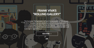
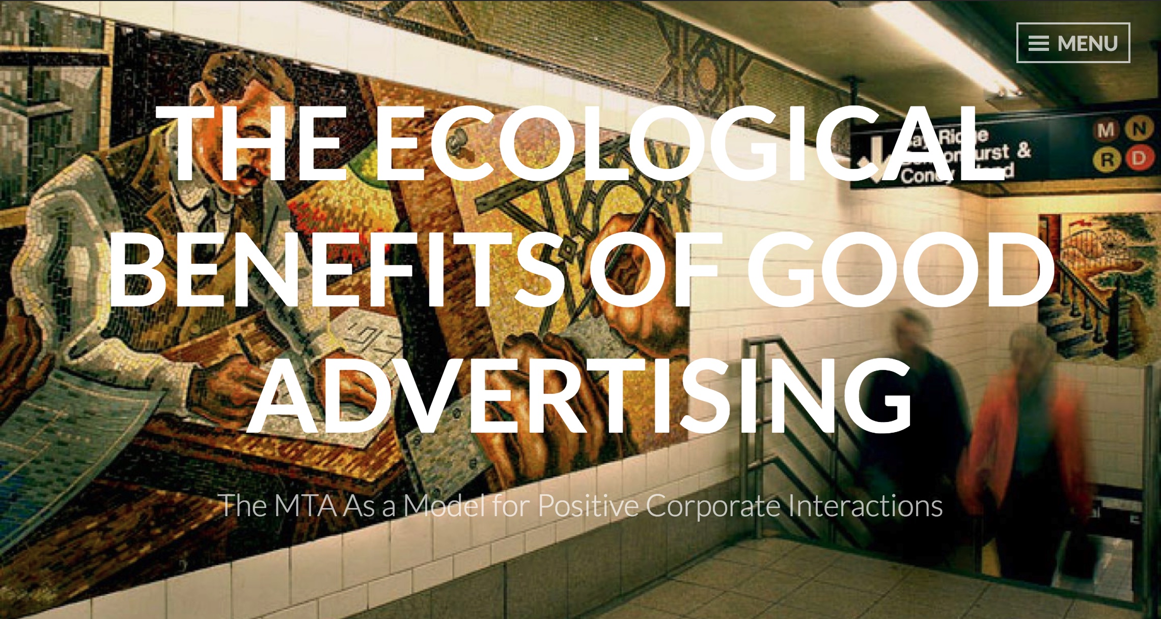
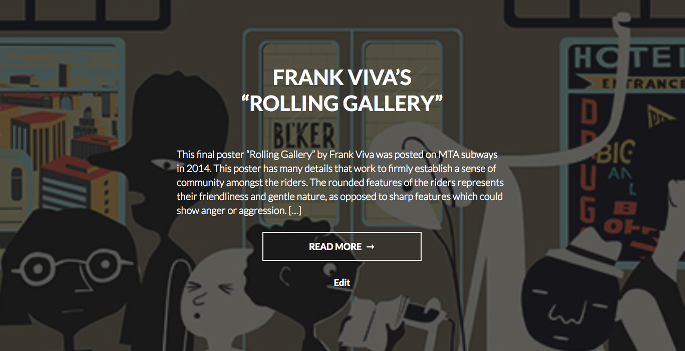
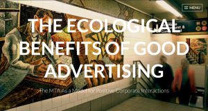
My project’s homepage prominently displays the title and subtitle of my project (shown at the top of this post). Underneath are snippets of each blog post with the analyzed advertisement in the background. The title of the piece, the beginning of the text analysis, and a portion of the image gives users a taste of the advertisements that they will read about in each blog post, which makes the posts seem more enticing. The background scaling also changes dynamically depending upon window size and browsing device, which keeps it well formatted across multiple platforms.
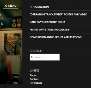
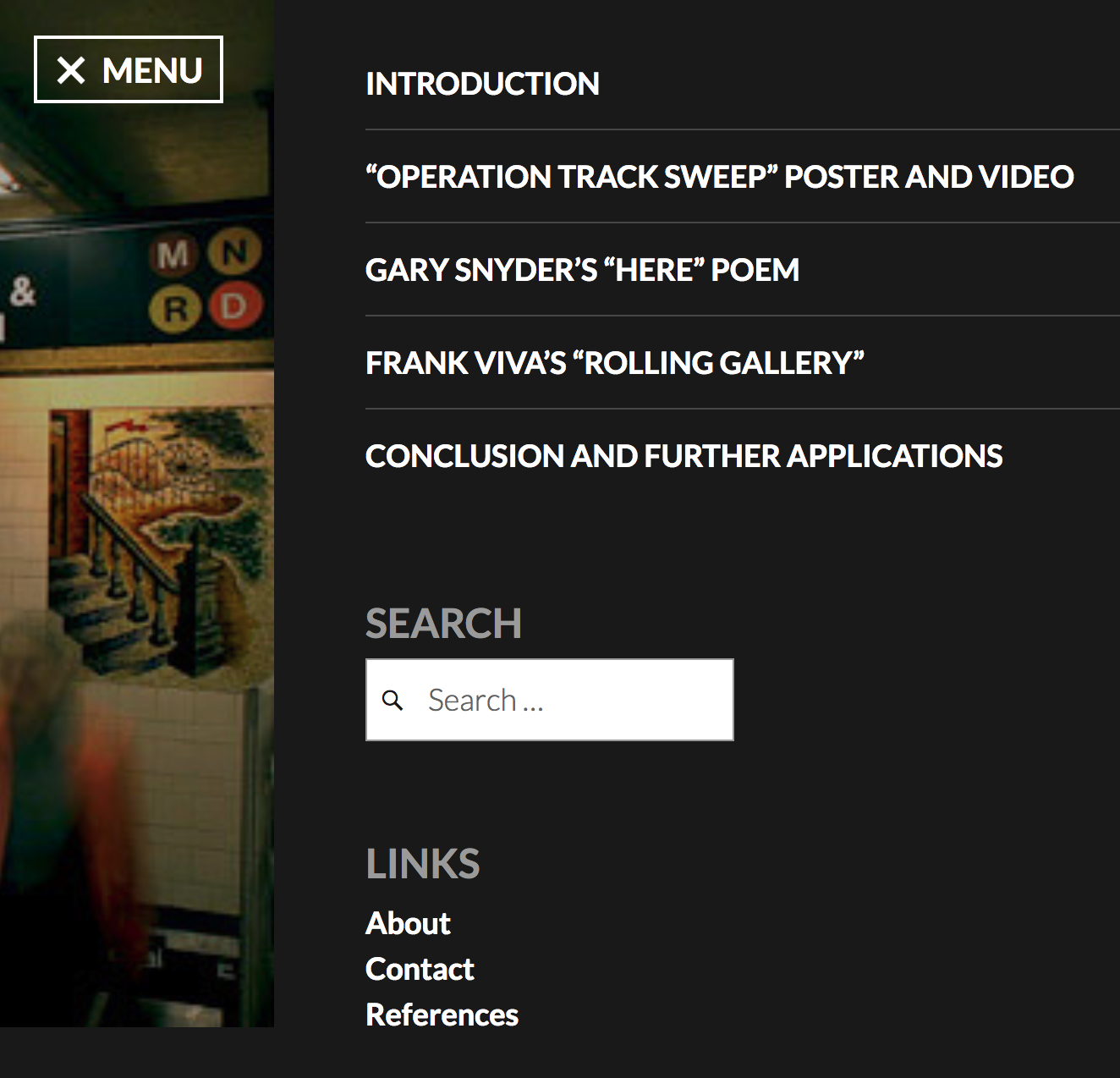
Each blog post can be clicked on from the homepage. Some of the blog posts include interactive features, such as embedded YouTube videos or slideshows paired with analysis. At the bottom of each blog post there are options to move to the next or previous blog post. From anywhere on the website, a menu on the top right can be used to jump to any page on the website, including the home page, about page, references page, contact form, and any of the blog posts. I depict and discuss more about the menu button later in this post.

I had initially wanted my project to be a single-page experience, where a user would scroll through the project from top to bottom, as I believed this would be a very intuitive and simplistic user interface. I found difficulties with this format as I worked, such as the advertisements being so distinct from each other that making a single-page experience feel cohesive was nearly impossible, especially so after adding multiple smaller images of elements from each advertisement. After a discussion with Dr. Schacht, I realized that such a format is not very different from a traditional humanities project – the information was presented in a very simplistic way that could have just as easily been printed out as an essay.

I decided to move away from the single-page experience in order to take advantage of WordPress. Dr. Schacht had noted several ways that I could more meaningfully present my information with different WordPress themes, so I changed my theme to make the project more visually engaging and lend itself better to the visual analysis that I conduct. I settled on the theme “Intergalactic 2” for a number of reasons:

Something Dr. Schacht mentioned, which the theme Intergalactic 2 does well, is the ability to have a featured image behind posts on the homepage. On my project you can see a portion of the discussed advertisement in the background of each of the posts’ panels. The title of the piece, the beginning of the text analysis, and a portion of the image gives users a taste of the advertisements that they will read about in each blog post, making the posts seem more enticing. The background also changes dynamically depending upon window size and browsing device, which keeps it well formatted across multiple platforms.

An aspect of this theme that I feel conflicted on is the navigation menu. It slides out from the right side of the screen in an elegant way, and the menu itself is aesthetic and functions well with the short list of posts I have in my project. The only issue is that users can easily miss the small “MENU” button on the top right corner of the page. The menu button does not scroll with the page, so a user would have to scroll to the top to find the subtle menu button, which is not intuitive. There is no way to change the design of this menu button, so it is a flaw of the theme that I must deal with for now, and will account for in future projects.

Over the course of working on this project I learned a lot about web-design, digital tools, and overall about the humanities as an enterprise. Switching my website’s theme halfway through my project was not an easy decision, but it allowed me to realize the difference between what I had imagined in my head and what was viable for implementation. Over the course of this project I had tried out other online tools, such as HTML map tags to make sections of photos interactive, and StoryMapJS to try a timeline sequence approach to photo analysis, and despite not using them in my final product, I learned about the capabilities and limitations of each of these methods: HTML map tags are ancient and clunky, while StoryMapJS does not have the ability to do photo analysis that I had wanted.

I have learned that humanities is an ever-evolving field as it moves into the digital realm, with more tools available now than traditional humanities projects could have ever had access to. Digitization allows for deeper analysis with online tools, makes it easier than ever to share projects with others who may be interested, and propels the humanities into the 21st century.
Fall 2017 Final Presentations Live Stream

Final presentations in ENGL/INTD 388 Digital Methods for Humanists will be streamed live via Google Hangouts on Air from approximately 3:30 pm till approximately 6:40 pm on Thursday, December 14.

Update: The live stream is no longer available, but you can watch a recording of the presentations right here or on YouTube. See below for a breakdown of start times by presenter.

  • Holly Gilbert (0:04)
  • Zack Veith (10:19)
  • Tyler Waldriff (18:39)
  • Michael Griffin (27:17)
  • Veronica Taglia (34:19)
  • Aaliyah Taylor (44:05)
  • Allison Maier (50:58)
  • Justin Anderson (59:22)
  • Isaac Sanabria (1:07:20)
  • Jack Snyder (1:17:38)
  • Phoebe Siegel (1:22:05)

Blog Post on the History of the Peloponnesian War

For my project I looked closely at the works of Thucydides and his historical depiction of the Peloponnesian War. I decided to use multiple different tools to create a more in depth analysis of the work and also to provide the reader with a better historical context of when each of the events described by Thucydides in the work happened in the timeline of the war. At first I was planning to just use Timeline JS on my project and provide a few different timelines that present the differences between the timeline of Thucydides’ work and the timeline of the actual war.

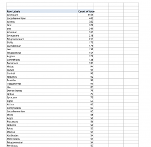
This proved to be insufficient in getting across all of the analyses I wanted to present in my project. Instead of doing this I met with Kirk and talked to him about organizing the mentions of people and locations in the book into pivot tables that showed the number of times each of these items were mentioned.With Kirk’s help we used GoogleMaps to create two different maps showing the locations that were mentioned.
The darker dots show that that item was mentioned more in the works of Thucydides than the lighter dots are. Along with these maps I provided an analysis of the pivot tables, explaining possible explanations for why some items were mentioned more than other such as a possible bias that Thucydides may have had on the side of the Athenians. To bring all of these different elements together I decided to create a wordpress site. This site has a different page for each map and timeline and comes with an analysis of each one.

This project is different from a traditional humanities because it is interactive. The viewer of the site is able to interact with the timeline by clicking on the different events which will then give a detailed background on the event.

They are also able to click on a spot on the map and learn the number of times that the word is mentioned and where the most mentions were located geographically.

I learned a lot about numerous different tools used by digital humanists. I am glad I had the opportunity to use multiple tools instead of just one and I had a fun time trying to set up the website so that it would present all of the information in a comprehensive way.

Sandstone Trail Final Blog Post

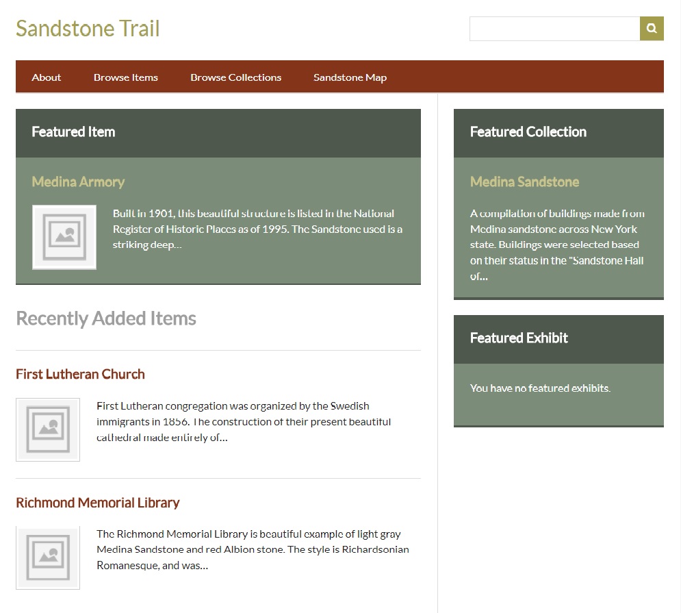
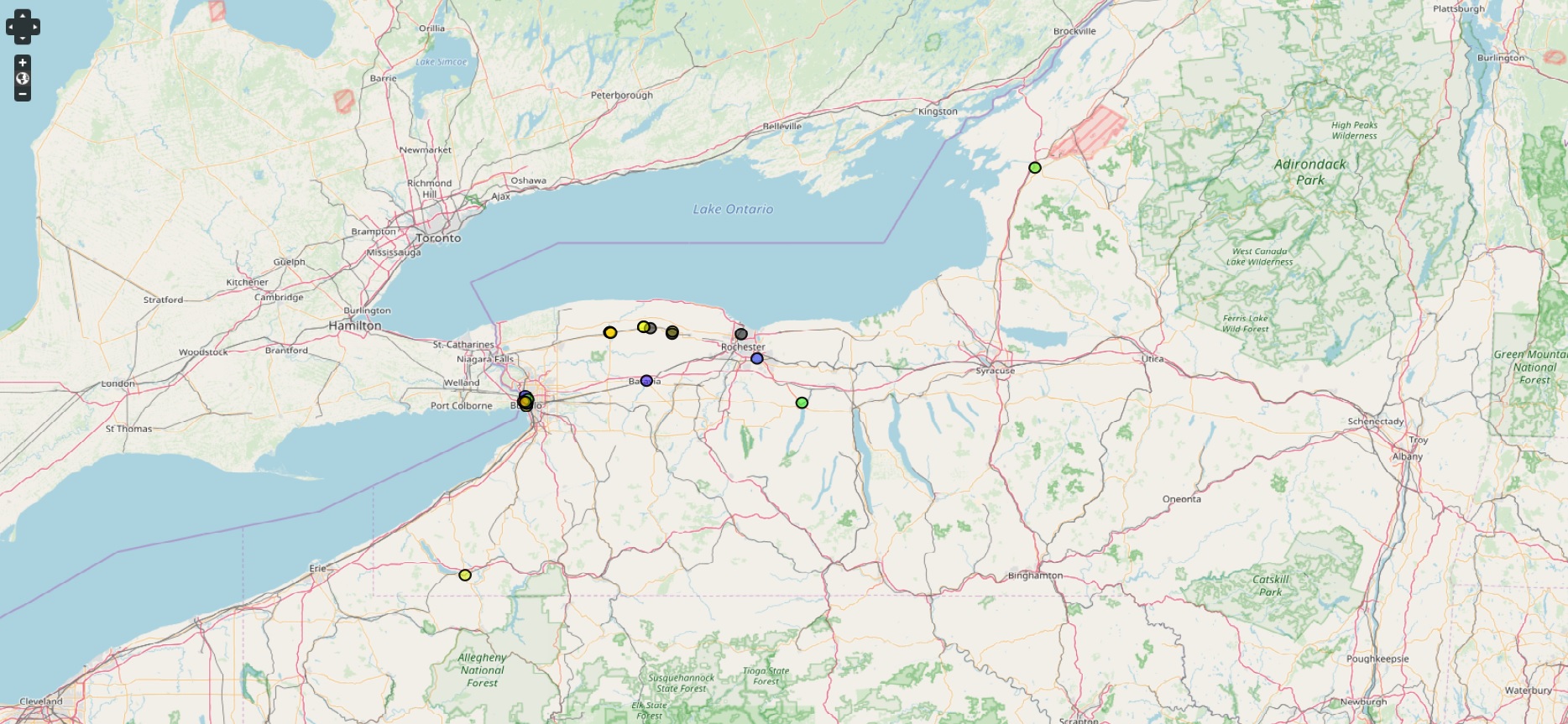
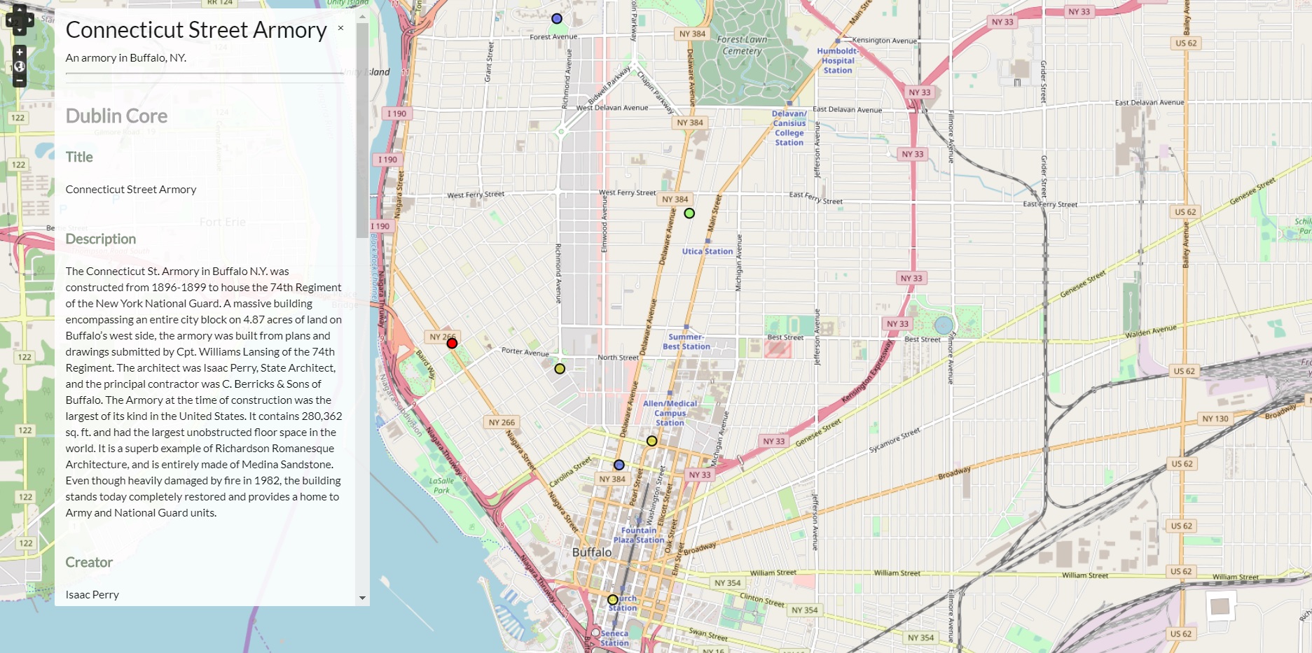
At long last, my digital humanities project, “The Sandstone Trail,” is complete. With it, I had set out to create an archive of noteworthy buildings that utilized the famed Medina Sandstone in New York. I wanted not only to organize an archive with key metadata, but to also provide a visualization of this information. This visualization is key, and differs from traditional humanities, because it captures the scope of how popular Medina Sandstone was. It is one thing to read that it was used across New York, but another to physically see the locations of the buildings, and what they look like. Each of the 21 buildings featured also include a brief history, as well as metadata that pertains to their location, architect, date of construction, function, and more. This information is easily accessed via the map by clicking on the locations, or through the “Browse Items” tab on the homepage. This archival method is superior to a traditional humanities method, because it provides an interface that allows users to search by tags, and links relevant metadata directly to the post, so that the user does not have to search elsewhere for it.

The site itself is also laid out to be very user friendly. Along the top are four tabs titled, “About,” “Browse Items,” “Browse Collections,” and “Sandstone Map.” The “About” tab includes some background on Medina Sandstone, and the relevance of the project. The “Browse Items” tab allows users to, as the name implies, browse the various buildings that are featured. Users may narrow their search by clicking on “Browse by Tag,” so that they may find buildings specific to one area, such as Buffalo or Rochester. “Browse Collections” includes the only collection that is available on the site, the “Medina Sandstone’ collection, which holds all the buildings. And last but not least is the “Sandstone Map,” which opens the Neatline powered map that enables users to go around New York State to look at the various buildings. From there, they can click on the numerous dots to view the history of the building, metadata, and a link to its page in the archive.

However, this progress was not achieved without some road bumps along the way. My initial problems were just getting Omeka to even run on my machine; thankfully, a trip to Dr. Kirk Anne was able to solve the issue. I had (and still have) problems getting ImageMagick to work, which would allow thumbnails of my images to appear on screen. Apparently, this is a Windows specific issue, which is unfortunate because it limits the aesthetic element of my project, but fortunately they can still be viewed, albeit not in a nicely formatted thumbnail. Adversity was also met in getting the Neatline map to function properly. Dr. Schacht and I were able to fix this, but even after leaping that hurdle, there came the problem of pinpointing the building locations. Unfortunately, Neatline does not follow the same coordinate language as Google Maps (where I pulled my information from) so I was not able to upload that and have a point placed on the map. Instead, I had to drop the pins for each building manually, and make approximations based off their location on Google Maps. It ended up working out fine in the end, but it was a very time-consuming process.

Overall, this project has allowed me to explore a method of presenting information that I would have thought impossible. In the case of my project, I have been able to represent an archive that would previously be represented only by text, and provide visual data to enhance the overall information that can be garnered. I was not well-versed in utilizing computer programs such as Omeka and MAMP, and now I not only know how to use them, but I understand just how beneficial they are in transcending the limitations of traditional humanities projects, so that they can become more accessible and informative.

Progress Report: Cornelia Adair and Digital Storymaps

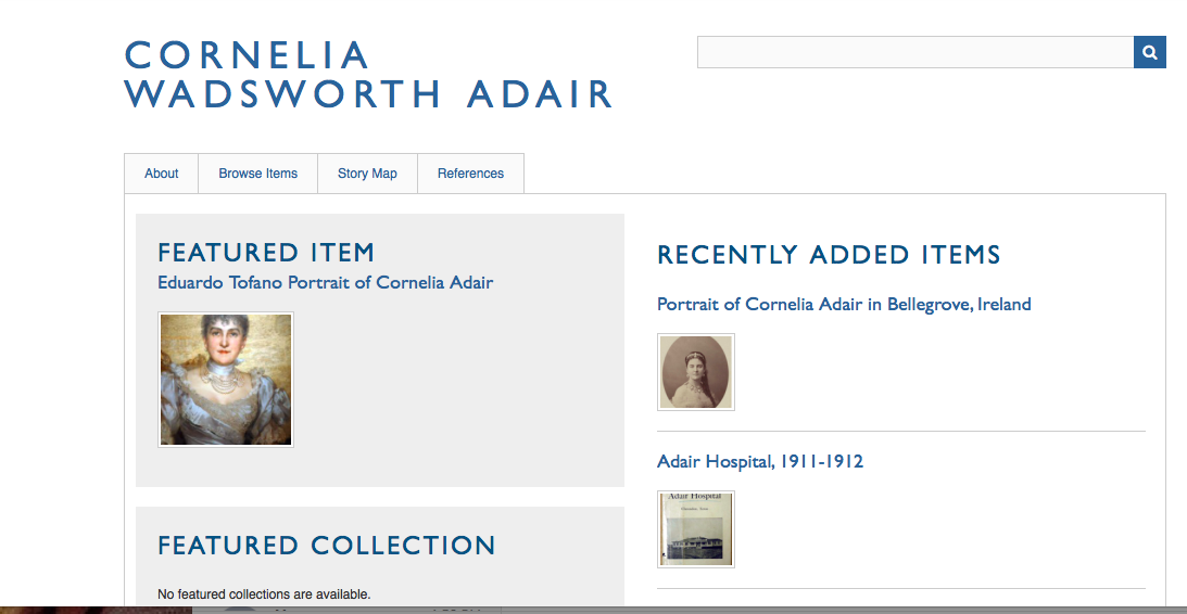
Initially, I was hesitant to use Omeka, because I felt out of my element in navigating the program and struggled to do basic tasks (e.g., creating a simple wepbage and putting it on my home site). But after playing around with it for the better part of two weeks, I’ve grown to appreciate how powerful the program is (especially in connection to project-related plugins, like Neatline). I’ve gotten more confident navigating my website and adding/categorizing items to my exhibit on Cornelia Adair. Currently, my homepage looks like this:

As you can probably infer, I have some major work to do–for one thing, I need to type out an introduction (re: the “about” section) that outlines Cornelia Adair’s biographical context and significance. Right now, my next big task is to get familiar with Neatline. Although I can link the items I’ve created in Omeka to records on Neatline, I’m struggling to pinpoint the Neatline records to specific locations on a map (I had thought it would be as easy as typing in locations on a search engine, but alas….). Given that the bulk of my project focuses on mapping out biographical information to tell a story about Adair’s connection to geographic spaces, I need to develop the map on Neatline or consider using a different plugin.

Continue reading “Progress Report: Cornelia Adair and Digital Storymaps”

Progress Report: Map of Black Politicians in the Natchez Region following the Civil War

For my project I have been working with Professor Behrend’s research on black politicians in the Natchez region after the Civil War. My final goal is to create a map, or at least the prototype for a map, detailing each person Professor Behrend has information on. With the map, I want to emphasize the change in the amount of black politicians in this region over time. Focusing on this increase highlights the grassroots democracy occurring during this time period, which is one of the main concepts in Professor Behrend’s book. I believe that a visualization of this concept (in this case, a map) would further underscore the point, particularly in a form that takes less time to consume and process than a book.

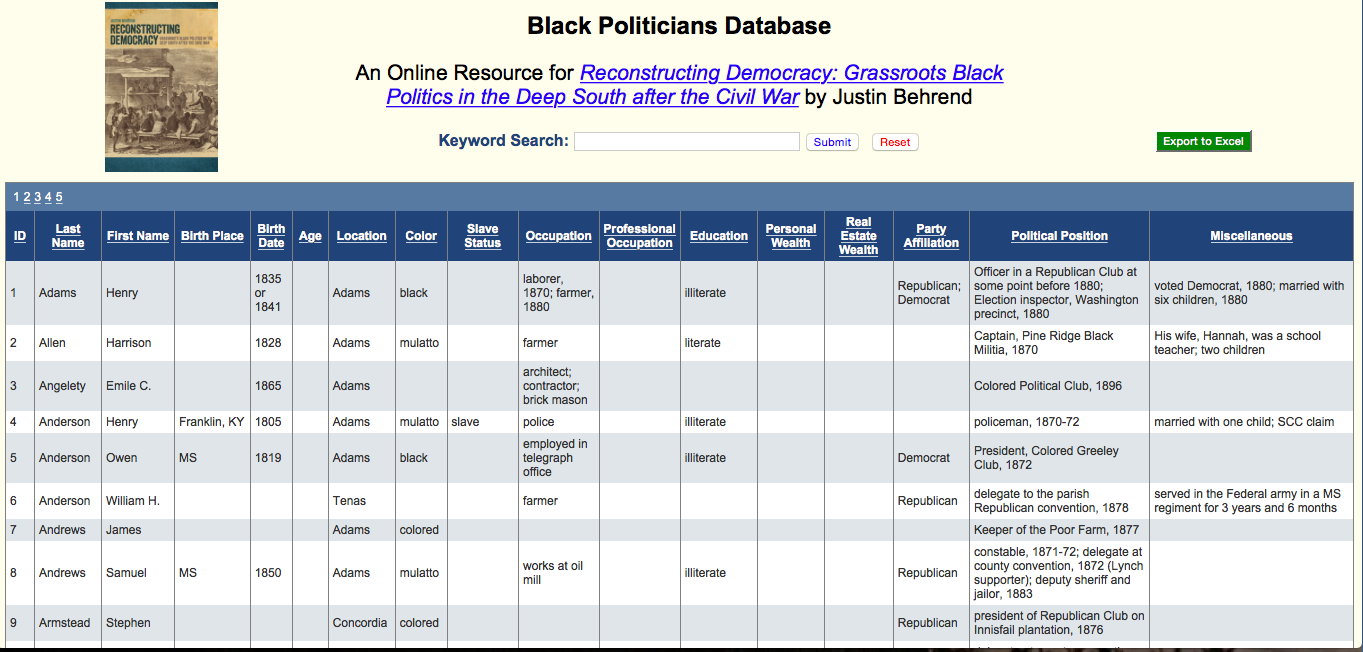
As it stands currently, Professor Behrend has his research on each politician stored in an online spreadsheet. Besides name and political office(s) held, the spreadsheet also includes biographical information such as birth year, county, occupation (besides political office), wealth, literacy status, slave status, and party affiliation.

Online spreadsheet storing Professor Behrend’s research.

If all works out, I plan to use Omeka with the plugin Neatline and SIMILE Timeline in order to create the map. I chose these programs because of their ability to both create a map and incorporate a timeline. The timeline is important, I believe, because I want to emphasize change in the political circumstance of this region over time.

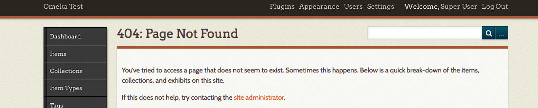
Installing Neatline has been one of the technological problems I have encountered so far. I have Omeka installed and running on my computer, but Neatline has been more of a problem. Apparently Neatline can be difficult to work with, so in order to deal with this Kirk and I have discussed getting a version of Neatline to run on a campus computer and doing the work for the project there.

Screenshot of the page I encounter while trying to use Neatline.

Currently Kirk and I are also working to create a comma-separated value (CSV) file of the spreadsheet data. One of the main problems we have been running into with the spreadsheet format of the data is slight spelling inconsistencies and multiple values in one category. For instance, the spelling of “mulatto” differs slightly between people (due to the different spellings in the original records Professor Behrend was working off of). While a person could understand that it is two different spellings of the same word, a computer cannot without being told. Different spellings have made the data somewhat harder to sort out.

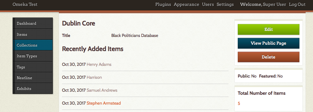
The other main formatting issue occurs when one category has multiple values. For instance, if a person held more than one political office, those two (or three, or four, etc.) are all under the category “Political Position.” The computer reads each category as one value, so if one person was a constable and another was a constable and a delegate, it would not recognize those two people as having had the same position. “Constable” and “Constable and delegate” are completely different values (not overlapping) to the computer. In order to solve these formatting issues, Kirk and I are creating a CSV file, where a comma indicates that what came before and what comes after the comma are completely separate values, even if they are in the same category. This will allow me to work with people who had multiple positions, was illiterate at one point but literate at another, or any other category that has multiple values. This CSV file will be uploaded to Omeka as a collection, which will then be used to create the map.

Example of a collection in Omeka.

In terms of the content itself, the major issue is sometimes there is not enough specific information. For instance, the location for each person is a county. This means that many people have the same location, so when I try to map them they are all in the same spot. Instead of looking like multiple points on the map, it simply looks like one point for each county. In order to combat this, what I have decided to do is place each person randomly throughout the county and have a disclaimer somewhere on the map which indicates that this, within county lines, the placement of markers is random. Another content problem is that sometimes we are missing values for certain categories. While most missing values are simply inconvenient—as we would like to be able to provide more information on each person—the one area that is it hindering is if there are no dates for political office. However, this only happens in a few cases so I think if the people without dates for political office are just on the map and not the timeline, the overall trend of an increasing amount of black politicians in the region will still be shown.

While I have run into a few problems so far—particularly on the technical, formatting, and content fronts—I believe they are all issues which can be overcome with help as I move farther along on this project.

Progress: Cold War Constructs and How They Relate to the Bond Films

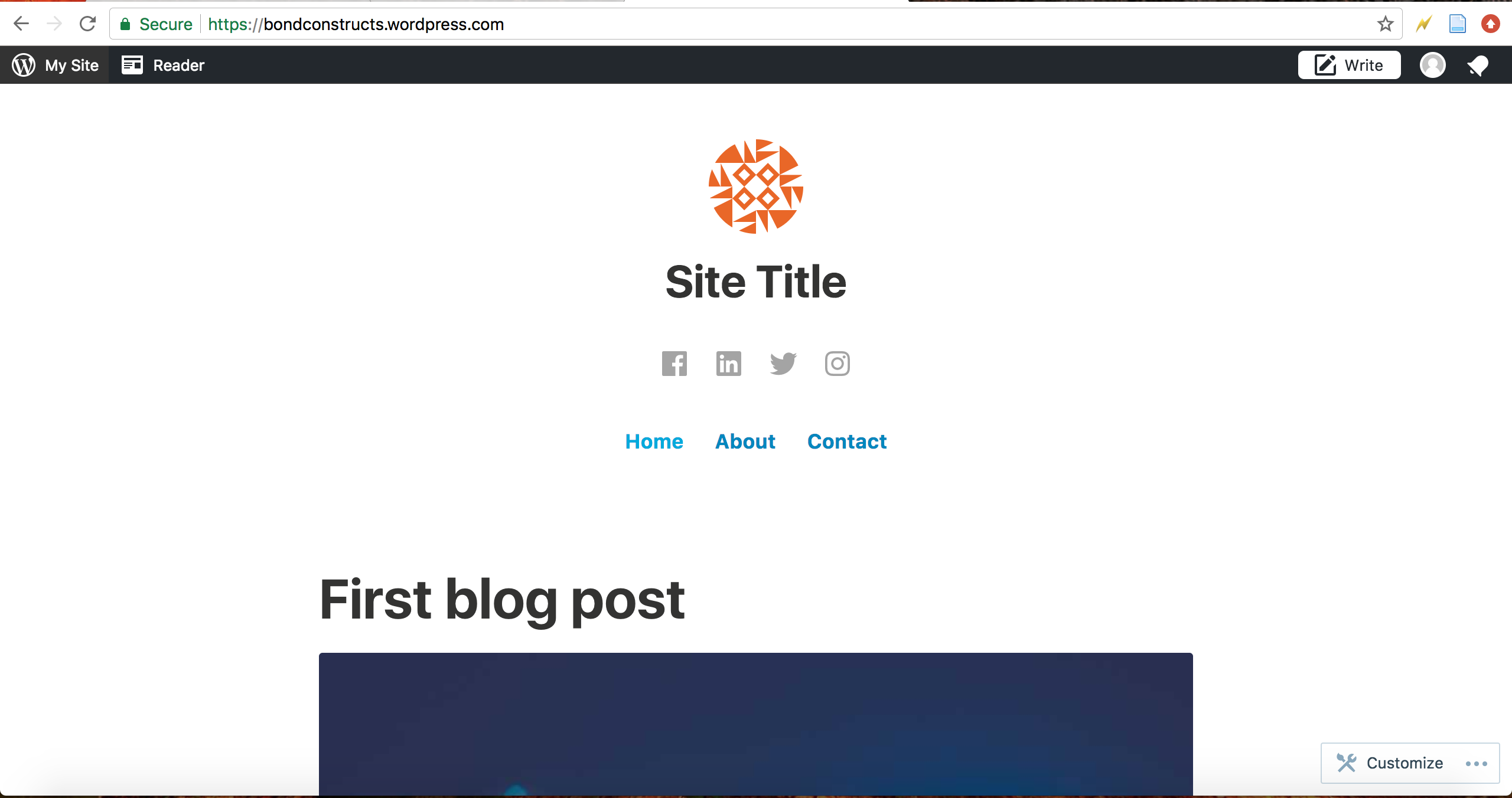
I’ve finally decided on a platform – WordPress. The simplicity of the layout, the editing tools available, and the interface all prove to be most effective in displaying my project. We’ve used WordPress before, but I had never spent much time playing with certain features or other tools.

After deciding on the layout, I began getting to work. I changed up the theme, font size, font color, the header image, the site icon, and much more.

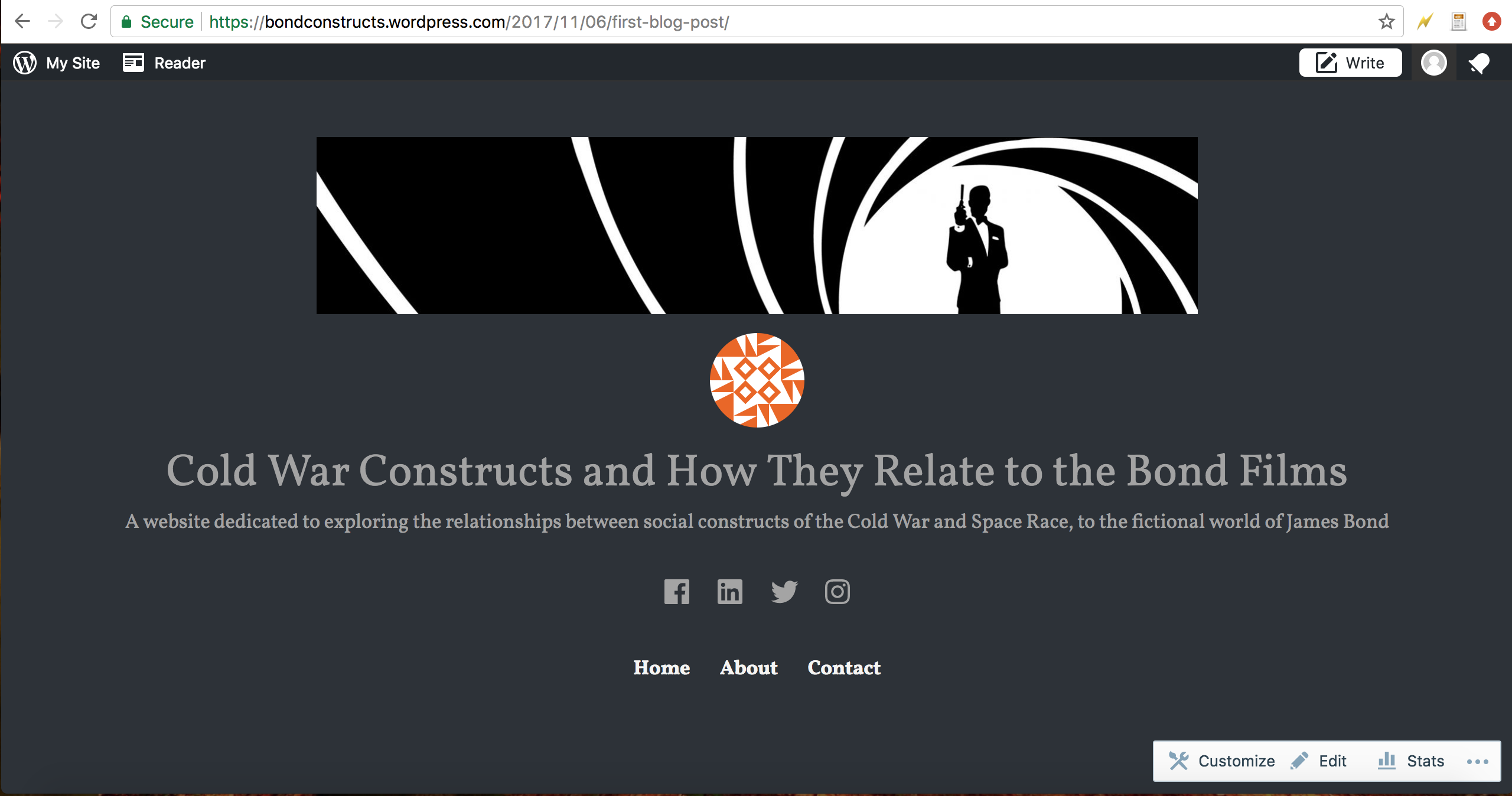
My project, which can be viewed here, aims to provide evidence that shows the connection between the James Bond films and the social/political constructs at the time of production. Out of all 24 (well, 27 if you include the films not produced by Eon Productions), I tailored down a list of six films that I will use in order to establish these connections, all of which is mentioned in the synopsis of my project, on the project’s website.

Some challenges i’ve had in my work so far is StoryMaps. I haven’t worked with StoryMaps before, so when I tried integrating a blank map onto my WordPress page just to see if ti would work, I found myself confused and I ultimately gave up. I’ll have to come back to StoryMaps seeing how it is an essential part of my project, but for the time being the challenges it’s given me have been too much to focus my time on.

This would just add to the list of changes I’ve had to make to my project since the thought first arose. I was originally going to try and compare all 24 James Bond films to their social counterparts in society, but doing so would have taken much more time than I have to work on the project. Since I had to scrap my original plan, I came up with a new idea. I decided to just choose six films instead of 24. And instead of focusing on the general cultural reactions the movies had, I decided to shift focus on the relationships between the films and the era of the Cold War/Space Race. This way, I will still be able to influence the reader to analyze the James Bond films, but I can do so using a more time-efficient method.


Another change that I’ve had to make to my project is shifting my focus. As I briefly mentioned, I shifted focus from a broad view of the cultural constructs to the way that the Bond films respond to larger problems created by the Cold War and Space Race. This was harder to do because it meant that my list of films decreased. There were only a certain amount of films produced within the ten-year span that I’m covering. Fortunately for me; however, I have already picked specific scenes that are going to help further my exploration.

Progress: The MTA as a Model for Positive Corporate Propaganda

My website hosting this project is live and can be viewed at any time at https://jacksnyderdh.wordpress.com/

My projects purpose is to highlight a subtle aspect of New York City life that I find intriguing – the MTA’s advertisements. These advertisements work as a positive form of corporate propaganda to build a sense of community amongst riders, reinforce continued use of the subway, and unconsciously and subconsciously promote better ecological habits. This project examines a handful of advertisements to break down how the MTA does this and the impacts these advertisements have on riders. I also conclude my project by suggesting that others could emulate the MTA’s types of advertisements for a number of reasons that benefit both the company and its target audience.

This project adapts traditional humanities work by analyzing the inner workings of how the MTA establishes a unified community of commuters, exposing and unpacking some factors that hold the subway riders together in the community, and suggesting how this community could be replicated by others.

Traditional work in humanities could not analyze photos like I plan on doing in this project. The digital tools I am using (WordPress, StoryMapJS, Photoshop) allow me to make an intuitive platform for graphical analysis that could not be achieved as well on a non-digital platform. The one-page homepage format of navigating my topic also allows for more fluid ingestion and perusal of the information contained than could be grasped from skimming a research paper or a book. Aside from benefits to presentation, these digital tools allow for a wider sphere of access to my project. In paper format, it would be difficult to find a publisher to spread my ideas to others. An easily sharable website allows for widespread distribution and direct engagement with the readers through comments or my contact form.

I had touched on this earlier, but by the end of my project I hope that my readers can understand how the MTA builds and maintains such a strong and ecologically aware community through advertisement, and can be able to see similar elements and methodologies in other types of advertisements in order to appreciate them as positive. The project concludes that other companies can attempt to replicate such a style of positive corporate propaganda with advertisements on the internet or on television to the benefit of the company, their consumers, and the environment.

There are a lot of toxic commercials in our world and on the internet that leverage stereotypes, gender norms, unhealthy attitudes, or other unethical means to sell a product. I hope that through this project, readers will be able to differentiate positive advertisements from toxic advertisements, understand how positive corporate propaganda can benefit both the provider and the consumer, and will leave with an increased ecological and communal awareness that positively influences their lifestyle and mindset.


The site is designed to be fully experienced from the homepage, although there is a quick links tab on the left side of the page to provide hyperlinks to the introduction, each individual advertisement, and the conclusion. I chose this homepage format because I think it lends itself to the natural progression of analyzing photographs as well as keeping all the main information centralized and easily digestible.

The about section will be filled with a general outline of my process through making the website and the final list of tools used. The references tab contains MLA formatted references to the photos, informational resources  and digital tools used throughout the project. The contact section is a simple form to send me an email.

When clicking onto a single section from the homepage, the site redirects you to the individual post and allows for sharing options, leaving a comment or response, and shows the titles of both the previous and next section, with links to each respective one’s individual post. I think its important to have a comments section for each individual post so that readers can interact with me and each other on the topic of the subject matter. Each of the posts can also be edited and updated if there is something worth adding later on, making it easy for me to update the website and keep it up to date.


One problem I had was the need to find a good theme in WordPress that lends itself well to a one-page design and allows for showcasing photos in that one-page design. There are a finite amount of free WordPress themes, and it is quite easy to preview them with posts you have made already, so I was able to privately upload a number of posts and see how various formats handled the simple text and photo combinations. I eventually settled on the WordPress team’s theme “Twenty Fifteen” due to the simple solid color background, clean side bar, and the clarity each post had from another while showing the full text and photos.

Another problem was figuring out how to annotate my photos in a more intuitive and interactive way than just referencing parts of the photos in the text. I initially considered using an image map generator or the HTML tag, although these are highly antiquated, non-user friendly, and unintuitive methods for annotating photos. Next I considered simple photoshopping of the photos with arrows or isolating elements and inserting them in-text. This can always be an idea I return to for highly important elements of the advertisements, but working with these pieces of the photos while still editing the text analysis for each photo makes it difficult to keep re-editing and orienting the elements properly in the text as I develop my ideas. Finally, I had tried using StoryMap JS earlier  in the semester to make annotations on my photos instead of a map, but I found trouble with the interface and could not figure out how to replace the map. I picked the effort back up after Dr. Schacht showed me a website proving that this was possible. I am currently making no headway on getting this to work, but it is ideal for what I want to do so I will be figuring it out.

A final problem I am having is finding good stock photos to include in my about section, references section, and contact form. Right now they are the theme’s default photos, but I plan on finding different cool stock photos related to subways or the environment or communities or something of the sort. I did use photoshop to combine a photo of a green earth and the MTA logo to make a logo for my site (shown left) which is featured on the top left of the homepage and in the site’s icon.
Through working on this project I have gained a better sense of how to work with WordPress, learned what HTML tags are and why they are obsolete, and developed my understanding of aspects of graphical construction in building an easy to browse website. I also learned that there is a lot of information on the internet to help with any digital tool you need, so resorting to a google search is nothing to be ashamed of.

Progress: Evolution along the Erie Canal

My DH project is interconnected with my research in Dr. Steet’s INTD 203: Social Foundations of American Education. I am looking into the impact of the Erie Canal’s construction on population redistribution in Western New York. Specifically, I am analyzing the connection between the construction of the canal, and the growth of the town of Perinton, which contains the village of Fairport. Known as the “Crown Jewel of the Erie Canal,” Fairport is a village which grew economically dependent on the manmade waterway. The Establishment of the canal led to the construction of numerous schools throughout the area, which eventually became centralized in the 20th century. I plan to use mapping and timeline tools to show the evolution of the village and town.

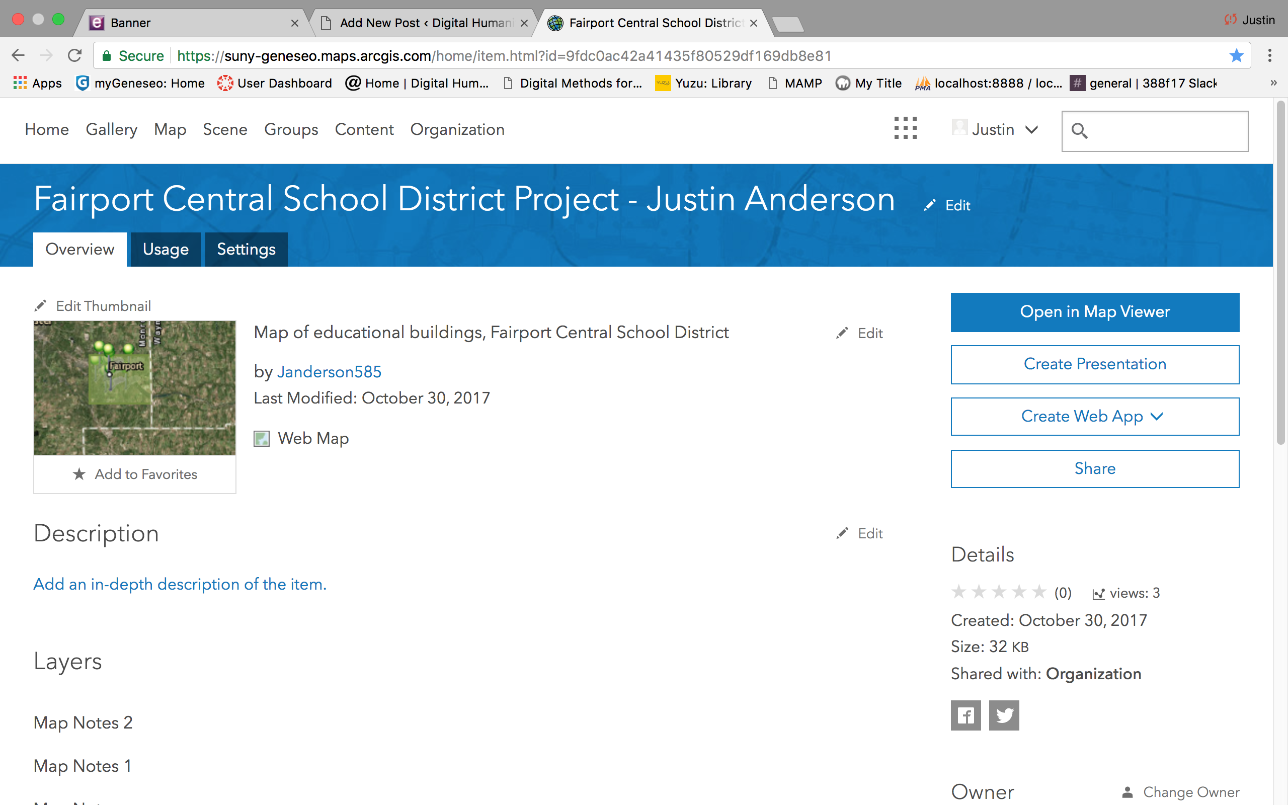
I am currently using arcgis online mapping to plot educational points of interest in my home town. A few notable educators of Fairport were educated at schools along the canal, and returned home to teach following teacher education at Geneseo Normal School. Perinton saw a few stages of development in education structure, from one room schoolhouses to one centralized district. These changes were brought about by multiple notable events, and I am making chronological maps to display these developments next to each other.

One area where I have encountered difficulty is the implementation of a timeline. I have not yet decided if I will make a separate, interactive timeline to present next to my maps. I am learning more about arcgis and will potentially download their software to use in place of their online hosting. Within arcgis online, a user can outline areas on a map and add layers to add metadata. I have added points to my map at the current schools in the district with various pieces of information. I have looked into layering a few maps on top of each other to allow for quick transitions. This is a work in progress, and I will continue to add to my maps as I collect more data.