Mapping Decline: St. Louis and the American City is a digital mapping project connected to the book of the same name by Colin Gordon. This project uses various programs, particularly ArcGIS and Social Explorer, to explore the relationship between people and a place (a common theme in traditional humanities) interactively.
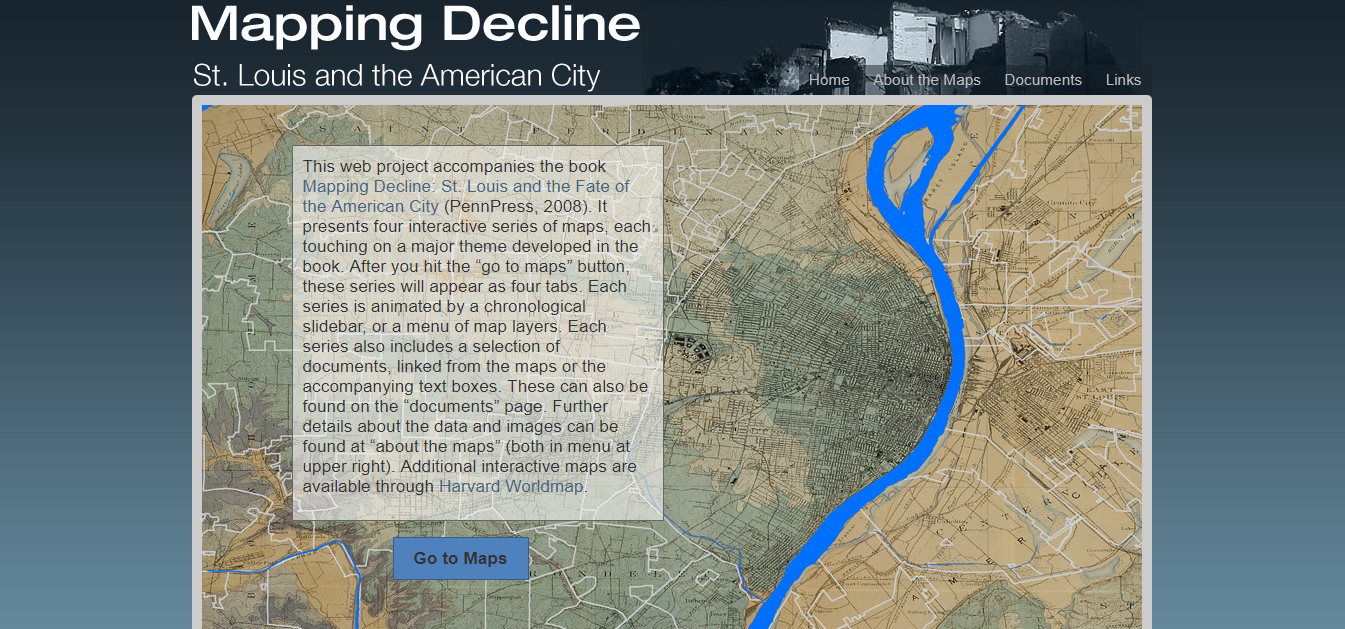
The project includes four maps, each connected to a theme from the book. It is not necessary to have read the book to understand these themes, as the site gives background information on each one. The book and digital project’s main goal is to explore certain demographics—in particular race and housing—in St. Louis over time. Mapping Decline specifically explores four themes: White Flight, Race and Property, Municipal Zoning, and Urban Renewal. Except for Race and Property, all maps include a slider bar in order for the user to see change in each topic over time. For example, the White Flight map includes four types of data: increase in white and black populations, and increase and decrease in white and black populations from 1940 to 2010. With the slider, the user can interact with the map and see the change in populations in certain regions for the specific time period.

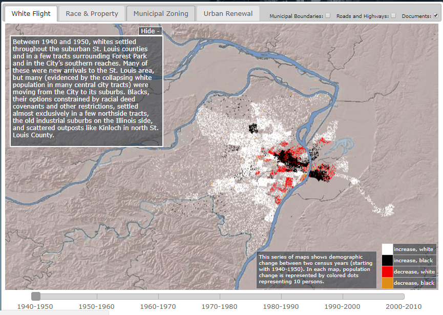
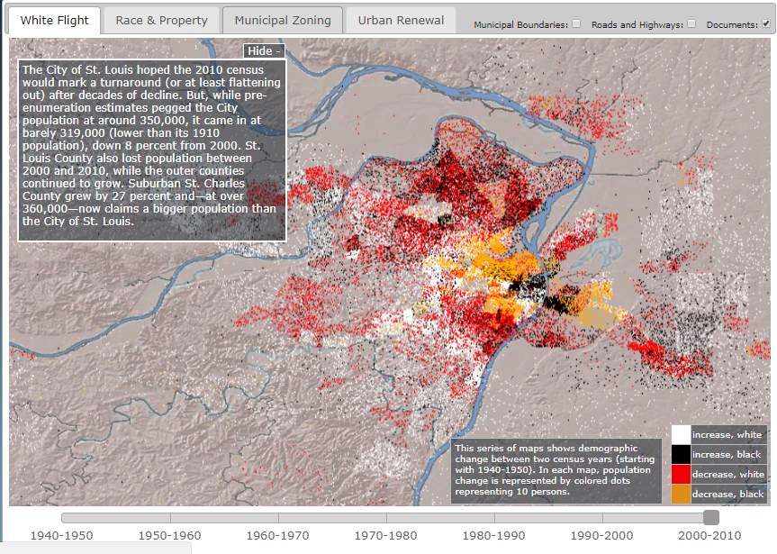
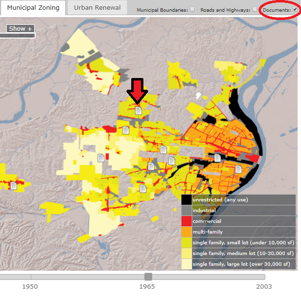
This project, since it is digital, can also reach a wider audience. One reason this project could reach a wider audience is because it is hosted on the Internet, which allows anyone with an Internet connection to access it. Another way this project could reach a wider audience is because, with it, Gordon can spread the message from his book in a condensed form. Instead of having to read the entire book, audiences can pretty clearly understand the ideas (or at least the data) Gordon covers in a much shorter amount of time. The project also includes links to documents which are important to the topic, something that is not offered by simply reading the book. In traditional humanities, you would have had to look up these documents on your own. Mapping Decline, however, allows you to access these documents with one click. A tab at the top of the site leads to a page talking about the documents, which includes links to digitized versions of the documents. Mapping Decline also offers the option of seeing the documents on the map itself. The user can turn on this option by clicking the “documents” button at the top. Once they are on the map, the user can get to the digitized version of the document by clicking the document symbols. Mapping Decline also has the option to enable municipal boundaries and roads and highways. Both by its location on the Internet and its form as a condensed version of Gordon’s book, Mapping Decline allows Gordon’s argument to reach a wider audience.
Mapping Decline was created using a few different programs. From what I can find, Colin Gordon, the author of the associated book, did most of the work for this project himself. The three mains programs used were ArcGIS, Social Explorer, and the University of Minnesota’s National Historical Geographic Information System (NHGIS). The NHGIS is a place to find data in file types which can be utilized by GIS systems. The specific version of ArcGIS that was used was ArcView 9.2. ArcGIS is a mapping platform run through ESRI (Environmental Systems Research Institute). The ESRI was founded in 1969 and as of 2014, held approximately 43% of the GIS software market worldwide (more than any other supplier). The other mapping program used to create Mapping Decline was Social Explorer. Social Explorer is only one program offered by the company of the same name. Social Explorer the company has roots going back to the late 1990s and also offers the programs Charts, GeoBuffer, and MapSpice. Social Explorer includes some data access (like the NHGIS) as well as the tools to build maps. As mentioned in the “About” tab of Mapping Decline, some of the data had to be adjusted in order to be mapped. For example, the 1960 data (which had 323 census tracts) had to be adjusted to fit over the 1950 geography (which had 247 tracts) for the 1950-60 map.
Mapping Decline is an example of how interactive, digital maps can help an audience to better understand the patterns in data. Finding patterns in demographic data which relate to larger social issues in a community (such as housing and racism) is a popular theme in traditional humanities, but interactive maps on the Internet, using programs like ArcGIS and Social Explorer, allow for both a better visualization of these spatial patterns and a potentially wider audience.




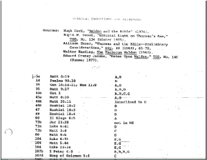 Our first obstacle was simply figuring out how to start; Ross’ materials stretched on for 72 pages of dense information, most of which we spent a good deal of time trying to decipher. We settled on using R to analyze Walden, using digital methods to parse out Walden the same way that Ross did by hand. By doing this we were able to test out the possibilities and limits of digitally analyzing a work of literature by comparing it to the analysis of the same work by a human scholar.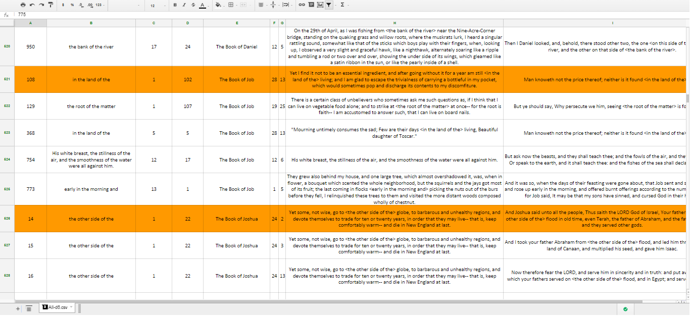
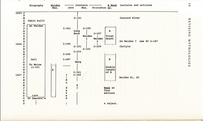
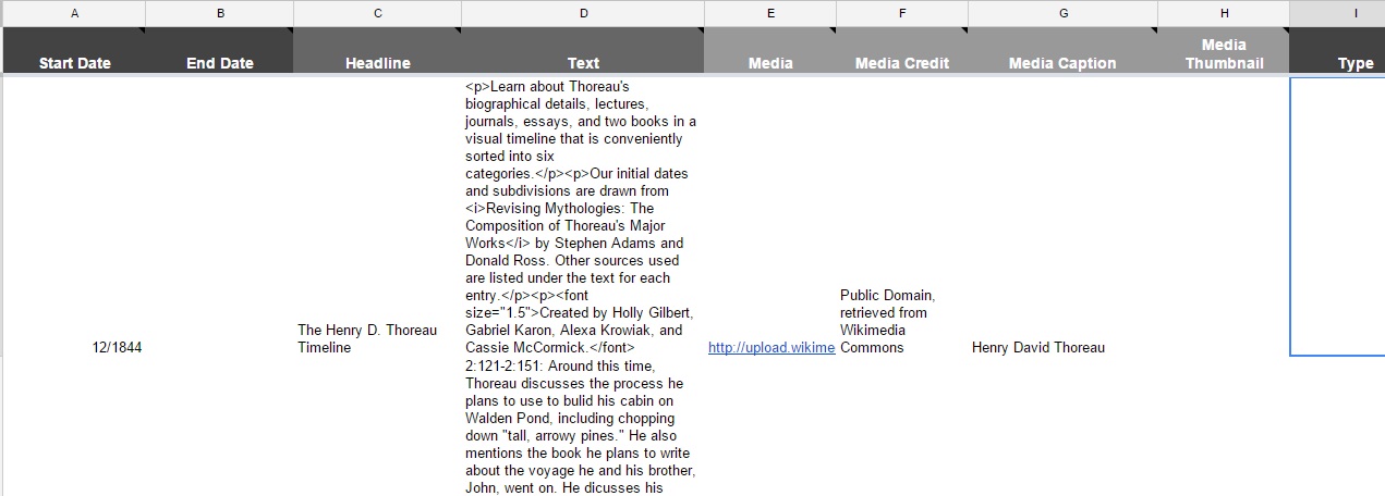
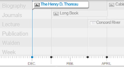

 project, we had to utilize various new technologies that many of us were not familiar with. A majority of our in-class planning time was spent writing scripts for our videos, and deciding what information was vital for using the site, and therefore warranted a video. We used the preexisting help page to guide us in deciding how to break up and designate the videos. We pulled from our knowledge of help pages we’ve used in the past, and came to the conclusion that one of the problems we’ve encountered with video help pages is that it’s difficult to pinpoint the instructions that directly address the individual problem. We considered a table of contents for our video but even that seemed too inefficient. We endeavored to create a more productive tutorial that could offer users instant and specific guidance. As a result, we decided to make a multitude of shorter and more direct videos, to establish that the help page is as user-friendly as possible. It was up to us to condense as much aid and instruction into a series of short tutorials. It was not a simple feat since the previous year’s group could compile their detailed instruction into a drawn-out